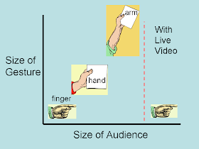
In a detailed 2009 blog post Andrew Dlugan discussed Are Your Speech Gestures Too Small, Too Big, or Just Right? He pointed out that the size of the gestures usually should match the size of the audience. An exception is in a large room, when a magnified image of the speaker appears on one video screen, and prepared images such as PowerPoint slides appear on another screen.
In this special case the gestures can be much smaller and still be effective, as is summarized in the image shown above. If the speaker is not prepared though, he may appear like an angry fairy-tale giant with beanstalk issues, as shown below.

Back in 1994 Successful Meetings magazine had an article by Dona Meilach about what to do When Your Presenter is Larger Than Life. She gave advice for preparing the speaker, the video cameraman, and the meeting planner and then conquering the big room.
The speaker was advised to practice to eliminate nervous gestures. Don’t rock from side to side. Don’t move your tongue to wet your lips - you’ll look like a lizard. Instead, get a drink of water before you begin speaking. Wear solid colors rather than detailed patterns that will flicker. Don’t wear photochromic glasses - they will become dark under the bright stage lights, and your eyes will be hidden completely. Women should wear simple jewelry and avoid long, dangling earrings. Also, please don't sneeze.
The cameraman was advised to place the camera high enough to avoid up-the nostril shots of the speaker, or getting the audience’s heads in the images. Check that the lighting for the speaker doesn’t spill over and wash out the screen images.
Finally, the planner was advised to have a session for preparing the speakers, and enough time for the audiovisual staff to set up properly. Consider the room layout, and placement of the podium and lectern. Avoid camouflage from complicated or very dark backgrounds.
No comments:
Post a Comment