I have been reading and greatly enjoying Cole Nussbaumer Knaflic’s excellent recent book Storytelling with Data: a data visualization guide for business professionals.
In my March 17th blog post on how 3-D Pie Charts are the Spawn of Satan I used an example of what NOT to do taken from her book. In this post I’ll show an example of what you should do.
This 267-page book has ten chapters titled:
1] The importance of context.
2] Choosing an effective visual.
3] Clutter is your enemy.
4] Focus your audience’s attention.
5 Think like a designer.
6] Dissecting model visuals.
7] Lessons in storytelling.
8] Putting it all together.
9] Case studies.
10] Final thoughts.
She points out that some people stop after doing an exploratory analysis, when they really should keep on going, do an explanatory analysis, and tell a story.
For example, look at the table shown above with ticket volume (work orders) by month for an information technology (IT) group. If we stare at it for a minute or two, we eventually will discover that in the second half of the year the volume processed fell to about twenty percent lower than the volume received.
The column chart shown above (done with Microsoft Excel) lets us visualize that data more clearly. (Click on it to see a larger, clearer view). It is how that information might be displayed on a business dashboard. Our reaction might be a yawn, and to ask So What? if we don’t know the context.
But to that IT group having the blue and red columns match up says they’re keeping up with incoming work. Getting all those tickets processed is their key performance indicator.
A column chart still is clumsy. It is not an effective visual. A line graph would be better. In Chapter 3 (on page 90) she uses that data in a section on Decluttering: step by step. Her original done with Excel defaults had a horizontal axis with month labels, a vertical axis from 0.00 to 300.00 (with gridlines every 50.00), blue triangles and lines for Received, and red squares and lines for Processed. She removed the chart border, gridlines, and data markers. Then she cleaned up the axis labels from months (shown diagonally) to three-letter abbreviations (shown horizontally), and labeled the lines directly instead of using indirect axis labels placed underneath the month abbreviations. This example also is discussed in her 29-minute March 1st YouTube video, Declutter Your Data Visualizations, for three minutes starting at 7-1/2 minutes.
In Chapter 5, Think like a designer, Cole revisits the ticket example. So far it’s missing a title or headline, and doesn’t yet tell a story. Her Figure 5.9 adds a title, Ticket volume over time. Then in Figure 5.10 on page 144 she adds a Headline (action title) and a supporting story text.
Her headline is: “Please approve the hire of 2 FTEs”
with a subtitle: “to replace those who quit in the past year.”
Her story text is that:
“2 employees quit in May. We nearly kept up with incoming volume in the following two months, but fell behind with the increase in Aug and haven’t been able to catch-up since.”
My version (without the FTE acronym) is shown above. Also, note that we’d be in huge trouble if we had another month like March.
An earlier version of this example (with slightly different numbers) had appeared on June 29, 2012 in Cole’s blog post on Drawing attention with data labels. I created my version starting from her Excel file linked to at the end of that post. There are another twenty examples in the Gallery at her Storytelling with Data web site.
This example also is discussed 5 minutes into Cole’s 53-minute YouTube video of her Authors at Google presentation.
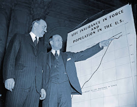
The 1939 image of Ernest How and Douglas Davenport explaining a chart came from the Library of Congress.


No comments:
Post a Comment