“Sorry but I like Tom's chart MUCH better!”
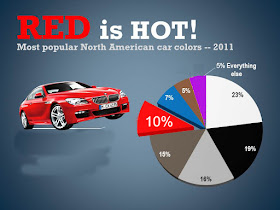
Tom’s slide is prettier than mine, but I think his does not clearly communicate that data. So, I’m going to gradually remove what I think is superfluous from his. The first problem with his chart was that it has ten wedges, one for just 1% and two for 2%. That’s way too many. On page 71 of her 2008 book slide:ology Nancy Duarte advised:
“Limit a pie chart to eight sections. More is too many to differentiate on a slide.”
As shown above, those two 2% wedges should be combined with the 1% one, into one 5% wedge for Everything Else.
The second problem with his chart was the huge outboard data label (in a font larger than the slide title) pointing to the red wedge. It already was identified by being exploded from the chart, so I put that white label back on the wedge, but using a larger font than for the other wedges.
The third problem with his slide was using a stock photo of a red BMW coupe with a German license plate (from Munich). The subtitle claims the chart is about North American car colors. Why does it show a foreign car? Note that after it’s removed you can see that the pie chart covers a relatively small area on the slide.
The fourth problem with his slide was the title. Red was the fifth most common car color. Would you ever say that a pro sports team which is fifth in its division is HOT? When only 1 of 10 cars is red, how can you say that color is hot?
Saying red is hot also is nonsense when viewed as a temperature. White is much hotter than red, as you can see in a Colour chart for forging and hardening from Uddeholm.


No comments:
Post a Comment