Showing posts with label infographics. Show all posts

Thursday, March 30, 2023

Can I draw you a map?


Some information can best be understood using a map. At IdahoNews on March 27, 2023 there is an article titled Police: Top traffic crash location in Boise had 59 crashes throughout 2022. It lists the following eleven intersections (with the east-west street shown first):


W. Overland Rd./S. Cole Rd.– 59

W. Franklin Rd./N. Milwaukee St./– 54

8300 W. Overland Rd. [Walmart Supercenter] – 51

W. State St./N. Gary Ln./ -51

W. Fairview Ave./N. Milwaukee St./– 51

W. Fairview Ave./S. Five Mile Rd./– 51

N. Eagle Rd./Chinden Blvd./ - 49

W. Overland Rd./S. Maple Grove Rd./ - 47

W. Overland Rd./S. Five Mile Rd./– 45

W. Overland Rd./S. Orchard St./– 45

W. Fairview Ave./N. Maple Grove Rd./– 45


At these locations there were a total of 548 crashes. Five of the 11 top locations are intersections on one three-and-a-half mile stretch of four-lane West Overland Road in Southwest Boise. They account for 247 crashes. Why is that?


As shown above via a map created using PowerPoint, Interstate 84 runs parallel to Overland Road, then turns southeast and goes right under the intersection with Cole Road. Also, a mile west (at Maple Grove Road) is where the Interstate 184 spur known as The Connector heads off northeast to downtown.


The busy mile of Overland between Maple Grove and Cole with 157 crashes also has a Walmart Supercenter. And the northwest corner of Cole and Overland has the Boise LDS Temple. A mile further north is West Franklin Road, and northwest of Cole and Franklin is the large Boise Towne Square Mall, surrounded by lots of other stores.


Sunday, March 12, 2023

A YouGov survey on ten things that Britons fear or have a phobia of


There is an interesting article by Peter Raven at YouGov UK on February 27, 2023 titled What do Britons say they have a phobia of? It describes results from a survey of about 2000 adults done on January 19 and 20 which asked about the following ten things (in alphabetical order):


Clowns

Dogs

Enclosed spaces

Flying

Going to the Dentist

Heights

Needles

Public speaking

Snakes

Spiders


One set of questions was about phobias:


“For the following question by phobia we mean an overwhelming and debilitating fear of an object, place, situation, feeling or animal … Which, if any, of the following would you say you have a phobia of?”


Another set was about fears, and asked about four levels: Very scared, Somewhat scared, Not really scared, and Not scared at all (plus Don’t know). All the detailed results are listed in tables that can be downloaded via a .pdf file.


Results for phobias are shown above in a horizontal bar chart. The five most common are heights (23%), spiders (21%), public speaking (15%), snakes (14%), and enclosed spaces (13%).


Results for phobias by gender are shown in a second horizontal bar chart. There are some large differences. Spiders are feared by 26% of females, but only 16% of males. Heights are feared by 24% of females and a similar 22% of males. Enclosed spaces are feared by 17% of females, but only 10% of males. Public speaking also is feared by 17% of females but only 13% of males. And snakes also are feared by 17% of females but only 11% of males.


In the YouGov article they showed a single graphic with three horizontal bar charts for phobias – the usual blue for Males, but red for all Britons (instead of Females) and purple for Females. On March 10, 2023 I blogged about their Comically poor color coding of bar charts in a survey of ten fears and phobias.


Results for fears (the sum for Very Scared and Somewhat Scared) are shown in a third bar chart. The five most common are public speaking (39%) heights (37%), snakes (33%), spiders (24%), and enclosed spaces (22%).


Results by gender for fears (the sum for Very Scared and Somewhat Scared) are shown in a fourth bar chart. There are some large differences again. Public speaking is feared by 48% of females but only 30% of males. Heights are feared by 44% of females and again 30% of males. Snakes are feared by 40% of females, but only 28% of males. Spiders are feared by 33% of females, but just 15% of males. Enclosed spaces are feared by 30% of females, but again only 15% of males.


The second graphic in the YouGov article (with a set of stacked bar charts) is shown above. As I discussed previously, it has a confusing color shift from red to purple.


But worse yet, it is quite misleading. It presents overstuffed and then rescaled numbers. As shown above, for Heights, the real data is for Very scared, Somewhat scared, Not really scared, Not scared at all, and Don’t know – which should add to almost a hundred percent. The 23% for Phobia does not belong in that stacked chart – it is from a different question. When included and rescaled it alters and falsifies the data from what is in the tables. For example, the percentage for Very scared drops from 32 to 25, and that for Somewhat scared from 35 to 27.


The article text claims:


“Including the aforementioned 23% who say they have a phobia of heights, half of Britons (52%) say they have some form of fear of being up high, with the further 29% being either ‘very’ or ‘somewhat’ scared of heights.”


That fear of being up high really isn’t 29%, it is 37% (5% plus 32%).


The third misleading graphic in the article claims to show the effect of gender on the sum of a phobia and very plus somewhat scared. It also is peculiarly color coded with pink for males (labeled as men) and purple for females (labeled as women).  Let’s again look at results for heights. The graphic shows 46% for men and 57% for women. Subtracting the phobia results of 22% for men and 24% for women leaves a claimed sum of 24% for men and 33% for women. But for men the table instead shows 3% for Very scared and 27% for Somewhat scared – a sum of 30% (not 24%!). And for women the table instead shows 6% for Very scared and 38% for Somewhat scared – a sum of 44% (not 33%!). Putting it another way, while the graphic shows 46% for men and 57% for women those silly sums should be 52% for men and 68% for women.  Like the second graphic, the third graphic presents overstuffed and then rescaled numbers.  


Sunday, July 12, 2020

How not to construct an infographic about speech anxiety


At VENNGAGE there is an infographic (shown above) from Rachael Keeney titled Speech Anxiety and subtitled What You Need to Know About Glossophobia. Both the ‘graphic’ and ‘info’ aspects are questionable. The orange color code for 74% fear on the pie chart and for the 73% and 75% does not match the red icons of men and women.


I revised the infographic as shown above (changed the 73% and 75% from orange to red) and removed the superfluous pie chart. The fourth point on that list of Tips To Overcome Speech Anxiety is to Know your topic. But those 73%, 74%, and 75% (from Statistic Brain) are just baseless rubbish, which I blogged about in a December 7, 2014 post titled Statistic Brain is just a statistical medicine show.


Sunday, February 16, 2020

Graphicacy and how charts can lie


I have been enjoying reading Alberto Cairo’s excellent 2019 book How Charts Lie, which is subtitled Getting Smarter About Visual Information. It is all about graphicacy, the analog of literacy, which the Merriam-Webster dictionary defines as:
“the ability to understand, use, or generate graphic images (such as maps and diagrams).”

Mr. Cairo’s book has the following chapter titles:
1]     How Charts Work
2]     Charts That Lie by Being Poorly Designed
3]     Charts That Lie by Displaying Dubious Data
4]     Charts That Lie by Displaying Insufficient Data
5]     Charts That Lie by Concealing or Confusing Uncertainty
6]    Charts That Lie by Suggesting Misleading Patterns
(7)] Conclusion  Don’t Lie to Yourself (or to Others) with Charts

You can download the graphics from that book here. You can read the text here at Google Books. Alberto’s blog has a February 14, 2020 post on ‘How Charts Lie’: a few edits to the first print edition.


In Chapter 2 (Charts That Lie by Being Poorly Designed), his first example on page 54 as shown above, is what at first glance appears to be a plot having time as the horizontal scale with two lines on a common vertical scale one increasing and one decreasing. Instead it is nefarious nonsense. When you glance at the number in the upper right (328,000) you see it is only 35% of the one at the lower right (935,573). On October 1, 2015 at Politifact Linda Qiu described how a Chart shown at Planned Parenthood hearing is misleading and ‘ethically wrong.’ Cancer Screening was cherry picked as a topic that decreased. The largest category (which also increased) really was STI/STD Testing and Treatment.


In Chapter 3 (Charts That Lie by Displaying Dubious Data) on page 99 he uses the example shown above, where the red state of Kansas anomalously has the highest page views per person on Pornhub. Then he explains that Kansans likely really aren’t naughty. Northern Kansas is the geographical center for the U.S., and people whose location cannot be determined are assigned there by default. On February 10, 2019 I had blogged about another example - A misleading bar chart with inflated fear percentages. SlideHeroes had misread tables in a survey and wrongly used a cumulative percent that included people who had refused to answer (Didn’t Know). 


In Chapter 4 on page 121 (Charts That Lie by Displaying Insufficient Data) he uses a hypothetical example about smallpox and vaccination that I replotted as shown above. More people died because of the vaccine than did from smallpox. But that bar chart omits mentioning that actually 99 times as many people were vaccinated than not vaccinated. We just are shown the numerator for what should have been expressed as a fraction dividing by a very different denominator.


As shown above, I have replotted the graphic from page 122 to display calculation of the probability for dying. The percentage if you take the vaccine (0.01%) is forty times smaller than that (0.4%) if you do not. But the calculation calls for a lot of information - it involves knowing six percentages.   


As shown above, in my plot of his chart from page 123, we also can compare the number who died based on the figures for a mostly vaccinated population (139) with the disaster which would have happened had there instead been no vaccination (4000).   


In Chapter 6 (Charts That Lie by Suggesting Misleading Patterns) on page 168 Mr. Cairo first has a chart showing how employment rose after January 2017, when Donald Trump was inaugurated. Then he has another chart revealing that rise simply is a continuation of the same long rise going back to 2011 during the Obama administration.  


Back on January 28, 2011 I blogged about how Michelle Bachmann pinned my bogometer! In her Tea Party Express reply to Obama’s State of the Union address she showed a bar chart of the unemployment rate which suggested a jump under Obama. But there was a smooth curve going from Bush to Obama.   


Sunday, October 13, 2019

Top 10 Anxiety-Inducers for Americans, according to an August 2019 survey done for Endoca by OnePoll


Halloween is less than three weeks away, so it now is time to scare us with surveys about our anxieties and fears. On October 9, 2019 there was an article at SWNS digital titled A shocking amount of Americans think they have an undiagnosed anxiety disorder containing two tables along with both an infographic and a one-minute YouTube video. It also showed up at the New York Post retitled with the word startling rather than shocking. The article reported results from a survey of 2000 American done in August 2019 by OnePoll for Endoca (a CBD oil company).  


The SNWS article has a table listing percentages for the Top 10 Anxiety-Inducers shown above in a bar chart. Work (47%) was first, followed by a two-way tie (44%) for money worries and social gatherings, health issues (43%), conflict (42%), a three-way tie (40%) for meeting new people, my partner, and politics. Then finally came public speaking (38%) and large crowds (36%).  But their text listed different percentages for the Top 3 (indicating a lack of proofreading):
“Perhaps unsurprisingly, work was pinpointed as the number one source for anxiety with almost half of Americans identifying it as the biggest culprit., followed by social gatherings (47 percent) and money worries (45 percent).  


The article has another table listing percentages for the Top 10 Social Media-Related Anxiety-Inducers shown above in another bar chart.

The article had begun by claiming one in five Americans feel they have some type of undiagnosed anxiety disorder. But when you look at the National Institute of Mental Health (NIMH) web site about statistics for Any Anxiety Disorder you will find that ~20% is not shocking at all. An estimated 19.1% of U. S. adults had any anxiety disorder in the past year, based on results from the National Comorbidity Study Replication (NCS-R).     

Thursday, February 14, 2019

An infographic with almost unreadable sections


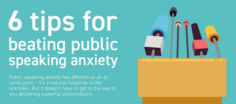
At BOSS magazine round this February 12th there was an article titled 6 Tips for beating public speaking anxiety that ended with an infographic from the British presentation design firm Buffalo 7. The infographic originally appeared on May 25, 2016 in another article at their web site titled as How to overcome presentation anxiety. Those tips were Nerves = Positive Energy, Perfect Your Intro, Use Deliberate Breathing, Don’t Rush – Take Your Time, Keep Movin’ On, and Use Body Language to Tour Advantage. The background in that infographic alternated between light green and bright blue and, but all the body text was white. Small white text on a light green background is nearly unreadable, as is shown above for just the very top of that infographic. Either that text should have been black (I changed the words speaking anxiety as an example), or the background should have been darker.

At Dave Paradi’s Think Outside The Slide web site there is a page with a Color Contrast Calculator for avoiding that graphical travesty of pretty but unreadable design.


At Entrepreneur on October 27, 2018 there was an article by Matthew McCreary titled 6 easy tips for conquering your fear of public speaking (infographic), which had another infographic version with a darker blue background, as is shown above.

Sunday, April 22, 2018

How not to deliver a world-class infographic on presentation anxiety


On August 4, 2017 the Hong Kong based Malcolm Andrews issued a press release titled Leading Executive Coach Reveals the Tricks to Delivering a Killer Presentation Despite Common Anxiety that linked to an infographic titled HOW TO DELIVER A WORLD CLASS PRESENTATION.  

On May 20, 2015 I blogged about Is that an infographic or just a totem pole scroll? In that post I noted that an infographic provides real information, while a totem pole just recounts legends. Malcolm’s infographic is 9.6 times higher than it is wide, and it requires lots of scrolling to read.


The section on anxiety at the top of this infographic, shown above, begins with a pair of ‘statistics’ that just are legends – and are displayed via silly donut (hollow pie) charts.

The first claim is: “Around 75% of the population worldwide suffer from the fear of public speaking, and for many, their fear is so great it could derail their careers.” On February 3, 2014 I had blogged about Busting a myth – that 75% of people in the world fear public speaking. In that post I chased down where that old number came from. It really just is about the U.S., and likely university students.


The second claim is: “In fact, 19% of the population are more afraid of public speaking than death, spiders, heights, and dark.” That really comes from a pie chart by Jim Peterson on the
Fear of public speaking statistics factsheet web page at his Speech Topics Help web site (shown above as a bar chart). Jim doesn’t say where those percentages came from, and I doubt they are real. The percentage for the sixth fear on the list, of people or social situations is out of place, and should be larger than that for public speaking. I discussed that on December 7, 2014 in a blog post titled Statistic Brain is just a statistical medicine show where I debunked their fears list that clearly was inspired by Speech Topics Help.

The third claim (repeating the first) is that: “Roughly 3 out of 4 people admit to being scared of public speaking. Now that’s huge!” This is followed by column charts showing the percent of females and males in ten countries, as two rows of four and one of two.


That data actually came from a Reader’s Digest Canada survey (the eleventh link) but aren’t explicitly identified either in the infographic or in the table at the bottom. But there really were 16 countries, so there should have been four rows of four. Malcolm left off India, Mexico, Netherlands, Philippines, Russia, and South Africa. I blogged about that survey on April 9, 2012 in a blog post titled Poll by Reader’s Digest Canada found fear of public speaking wasn’t ranked first in 15 of 16 countries surveyed. The table shown above lists both the percentages and the rankings by females and males. The averages for fearing speaking in public were 20.6% for females, and 17.1% for males – which are quite far from the 3 out of 4 people claim.

The fourth claim is titled “Top 10 fears of Office goers” but doesn’t say that data come from the United Kingdom, and just lists six of ten. Why not two rows of five, and why not use column bars instead of those silly donut charts with icons in their centers? Worse yet, the ninth link identifies my blog as the source – it points to a January 18, 2016 blog post titled Over a quarter of workers in the UK chose careers to avoid their office fears - although I had linked to the original source there.


Further down in the infographic, under Preparation it admonishes that “It is important to understand your knowledge gaps regarding the situation. About what you might know or not now (sic) about the subject and the presentation.” What is the knowledge gap for this infographic? That there was a social fears survey done for Hong Kong back in 2009. I blogged about it in a post on February 7, 2011 titled Fears of superiors and public speaking in Hong Kong. A bar chart with the results is shown above. Note that the percentages apply to 12-months, so the question would be “In the past year were you” rather than “In your life were you ever.”  Public speaking (public performance) came second to talking with a higher-status person.


Monday, February 26, 2018

Not the best way to annotate a graph


On the Speaking Pro Central website I saw an article by Rosie Hoyland at Presentation Guru on February 22, 2018 titled The Best Way to Annotate a Graph. She began by saying:

“A good graph will make its story quickly and clearly and how you annotate it will be a major part of telling that story. Clutter confuses and makes it difficult to see the wood from the trees, whereas simplicity enables clear and direct attention.”

She linked to a graph makeover article by Bruce Gabrielle at Speaking PowerPoint on January 24, 2018 titled 10 Rules for Graph Annotations. Bruce had started from a modification of an article by Matt Chambers at Sir Viz-a-Lot on November 28, 2016 titled Makeover Monday: The Wealth Gap. A graph of the data Matt began with is shown above. (I have borrowed the version of that graph shown at Business Insider in a November 23, 2016 article by Elena Holodny titled The top 0.1% of American households hold the same amount of wealth as the bottom 90%). Bruce actually had prettied it up by labeling the horizontal time axis at five-year intervals.    


Bruce’s starting point had referenced six points on that graph via text boxes with a total of over 130 words. My parody of it is shown above. Then he showed how to twiddle the layout to try and improve things. It’s far from best though. The basic problem still is that there are way too many words for a presentation slide. It’s a slideument or slidedoc – something that belongs in a handout for afterwords, or an infographic rather than a slide for during a presentation. Rosie should have referred to a guest article at Presentation Guru by Oliver Hauss on September 12, 2017 titled Can a slidedoc ever be a presentation?


What Bruce could have done was to unpack that slide into a set of six slides, each with a caption referencing a single point. That would have been seeing the forest for the trees. An example is shown above. Instead Bruce talked about Signposts, Text, and Placement and fiddled around. His advice makes sense in general though. He began with:

“Text is great. But too much text can feel overwhelming and unwelcome to read. People need to be able to skim your graph and get the message quickly. Long text annotations slow them down, so you need short text phrases (‘Signposts’) so the reader can skim.”

But isn’t signpost just another word for a headline? Why do we need another term to describe what we’ve already seen in newspapers?

Thursday, August 31, 2017

How NOT to display data - in a qualitative pyramid chart


At the D. John Carlson web site I found an article from August 31, 2017 titled 48.2% take 1 – 3 hours which also appeared at LinkedIn Pulse. It began:

“Research in the United States has found that there is significant variability in the time that bloggers take to craft high quality content. Headline findings were as follows:

1 hour –  7.7%

1-2 hours – 24.7%

2-3 hours – 23.5%

3-4 hours – 19%

4-6 hours – 13.3%

6+ hours – 11.9%”
Mr. Carlson’s article referred to but did not bother to provide a link to the FitSmallBusiness web site.


A search revealed that information came from a July 22, 2017 article at FitSmallBusiness by Henry Kanapi titled 15 Business Blogging Statistics That You Should Know. Number 8 was how long does it usually take to write an average blog post? Results were displayed in the qualitative pyramid chart shown above. But widths of the rows are unrelated to the percent for each time period. Also, heights of the rows are not constant, and the colors orange, yellow, and blue are repeated for no obvious reason. So, this idiotic graphic is neither meaningful nor pretty.

That data reportedly came from Statistica, which expects you to pay to see them. But those results really came from a 2016 survey done by Orbit Media Studios that was reported in a blog post by Andy Crestodina titled New Research:  3rd Annual Survey of 1000+ Bloggers (time, length, and tactics).


As shown above, that blog post reports more interesting and useful results for 2014, 2015, and 206 on both the average time for writing a blog post (hours), and the average length (words). In 2016 the average time was 3.27 hours and the average length was 1054 words. How else might we display those six percentages that appeared on that pyramid chart?


One possibility is via a standard horizontal bar chart, as is shown above.


Another is via a horizontal bar chart showing the cumulative percentages, as shown above. From it we could see that slightly over half (55.9%) of blog posts took 3 hours or less, and almost exactly 3/4 (74.9%) took 4 hours or less.

If you want to tell people something interesting and useful, then you need to get back to the original source for data rather than settling for a secondary one.


Monday, November 7, 2016

An interactive infographic shouldn’t make you yawn


Back on September 15th the Bloomberg web site featured an interactive infographic by Evan Applegate titled American Fright. It listed the top 42 fears from the 2015 Chapman University Survey of American Fears - in four columns and eleven rows. Each fear was represented by an image with a brief caption below it. When you pointed your mouse at an image, the percent of Americans that were Very Afraid or Afraid was shown at the right, beneath a skull icon. Yawn!  

I was not impressed by that infographic. It is harder to use than the ranked list shown in the Chapman blog post titled America’s Top Fears 2015, that lets you look at all the percentages at once and compare them. (The list also provides an alphabetical index). That infographic  incorrectly describes the survey:

“Chapman University asked 1,541 American adults what they fear most, then ranked the answers by the share of respondents who indicated “afraid” or very afraid” for each.”
 

The Chapman survey questions really were “How afraid are you of...?” not “What do you fear most?” and, there were four possible answers:

1 Not Afraid

2 Slightly Afraid

3 Afraid

4 Very Afraid

Then on October 31st Bloomberg did it again for Halloween with another similar infographic showing all 79 fears from the 2016 Chapman Survey in four columns. This one was created by Peter Jeffrey and titled What Americans Fear Most: Corruption, Reptiles, and Death. Of course that title instead should have been What Do the Most Americans Fear? Yawn again!

How much better and more useful could an interactive infographic from a survey be? On September 23rd I blogged about how Public speaking is not the most common fear for adults in British Columbia. Look at the infographic in an article published on June 17, 2016 by Insights West and titled Terrorism, Heights, and Snakes are Top Fears in British Columbia. It lets you build a stacked bar chart showing any of the fear at up to five different levels, and to choose either the whole sample or sub-samples based on geography or ethnicity.

An image of a yawning Japanese macaque came from Bruce1ee at Wikimedia Commons.    

Thursday, October 6, 2016

A misleading infographic about fears from Dr. Oz The Good Life magazine


Page 32 of the October 2016 issue of Dr. Oz The Good Life magazine has an Halloween Special article by freelance writer Gina Roberts-Grey titled Fear Factor. That article ends on page 34 with an infographic titled These Are a Few of the Scariest Things. It lists ten percentages (for percent Very Afraid or Afraid) that were taken from the 2015 Chapman Survey on American Fears. For each fear the percentage also is shown via a donut chart with an icon in its center.  But she did not bother listing where those fears ranked from #1 to #89.  They actually are:

Terrorist Attacks    44.4%   # 4

Reptiles                    33.0%  #17

Tornadoes                31.4%   #20

Public Speaking      28.4%   #26

Heights                    28.0%   #28

Needles                    18.5%   #52

Germs                      16.5%   #55

Flying                       15.2%   #61

Blood                        12.2%  #70

Ghosts                        9.7%   #78


Note that only one fear is listed from the Top Ten, just three are from the Top Twenty, and only five are from the Top Thirty. The other five aren’t even in the Top Fifty, which means they are a long way from really being The Scariest Things. It’s a frighteningly silly list!

On June 25, 2016 I blogged about How could you spin the results of a fear survey where public speaking wasn’t even in the top 5, 10, or 20? Gina Roberts-Grey’s article is another example of leaving out the rankings. 

The image is an angry selfie of Rembrandt from the Library of Congress