skip to main |
skip to sidebar

I’ve blogged enough about public speaking and presentations for this year. Next year I’ll be back, starting with a post about trying to photograph the recent lunar eclipse.
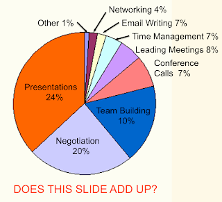
Yesterday on the Business Presentation Clinic blog I saw a post titled This Pie Chart Needs Rescue with a chart similar to the one shown above. One of the problems with this chart is that it displays nine different categories, while a pie chart is only effective for up to about five categories.
However, what struck me first was that the numerical labels on the chart shown above don’t match with their wedge angles. The largest category, Presentations, is labeled as being 24%, so that angle should be slightly less than 90 degrees. Instead it is much greater, more than 120 degrees. When you add up the nine numbers shown on the labels, you get a total of only 88%. The first kind of rescue that this chart needs is a look at the original data table to find the correct percentages that add to 100%. When you label the percentages correctly you get the following bar chart:
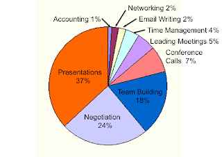
They went on to fix the problem of having too many categories with a revised pie chart (their Chart A) showing just the three largest categories, and grouping the other six into a fourth category marked Other (and then detailed in a table to the right of the pie chart).
They also displayed the data in three other ways: a stacked bar chart (Chart B), a bar chart (Chart C), and a column (vertical bar) chart (Chart D). I think that the bar chart is the best way for displaying all the data while emphasizing what is most important. All of the bars start from a common origin, so it is easy to compare their magnitudes. For the stacked bar chart they also added an table detailing the Other category. The column chart is unsatisfactory for presenting on a screen because the labels are vertical. You shouldn’t have to rotate your head to read. I really liked that all their revisions had headlines stating that The Majority of Our Employees Need Presentation Skills Training rather than Training Needs from Global Employees.
In a previous post I said that Pie charts do not speak clearly; they just mumble. In that post I referred to a 14-page newsletter article by Stephen Few from 2007 about why you should just Save the Pies for Dessert. He points out that:
“Because the pie chart was difficult to read, we added values so we wouldn’t have to compare the sizes of the slices and we added direct (company) labels so we wouldn’t have to rely on a legend. We turned the pie chart into an awkwardly arranged equivalent of a table of labels and values.”
When the bar chart can stand by itself, why bother with using a pie chart with labels (or a stacked bar chart plus a table)? Why not use either a chart or a table, and avoid straying somewhere in-between?
 One of the topics that overlaps with public speaking is heritage interpretation. Interpreters are people who who explain natural or cultural resources for visitors at places like parks, nature centers, museums, zoos, botanical gardens, aquariums, and tour companies. Interpretation also includes writing and graphic design of exhibits and signs.
The National Park Service does interpretation as part of their mission, like the snowshoe nature walk through Yosemite shown above. They have a very useful publication on the Foundations of Interpretation. In their discussion of its history they mention a book by Larry Beck and Ted Cable, Interpretation for the 21st Century: fifteen guiding principles for interpreting nature and culture. Those fifteen principles (which apply equally well to inspirational or motivational speaking) are:
"1. To spark an interest, interpreters must relate the subject to the lives of visitors.
2. The purpose of interpretation goes beyond providing information to reveal deeper meaning and truth.
3. The interpretive presentation - as a work of art - should be designed as a story that informs, entertains, and enlightens.
4. The purpose of the interpretive story is to inspire and to provoke people to broaden their horizons.
5. Interpretation should present a complete theme or thesis and address the whole person.
6. Interpretation for children, teenagers, and seniors - when these comprise uniform groups - should follow fundamentally different approaches.
7. Every place has a history. Interpreters can bring the past alive to make the present more enjoyable and the future more meaningful.
8. High technology can reveal the world in exciting new ways. However, incorporating this technology into the interpretive program must be done with foresight and care.
9. Interpreters must concern themselves with the quantity and quality (selection and accuracy) of information presented. Focused, well-researched interpretation will be more powerful than a longer discourse.
10. Before applying the arts in interpretation, the interpreter must be familiar with basic communications techniques. Quality interpretation depends on the interpreter’s knowledge and skills, which should be developed continuously.
11. Interpretive writing should address what readers would like to know, with the authority of wisdom and the humility and care that comes with it.
12. The overall interpretive program must be capable of attracting support - financial, volunteer, political, administrative - whatever support is needed for the program to flourish.
13. Interpretation should instill in people the ability, and the desire to sense the beauty in their surroundings - to provide spiritual uplift and to encourage resource preservation.
14. Interpreters can promote optimal experiences through intentional and thoughtful program and facility design.
15. Passion is the essential ingredient for powerful and effective interpretation - passion for the resource and for those people who come to be inspired by the same."
There is a National Association for Interpretation which also has a blog on Interpretation by Design (graphic design basics for heritage interpreters).
I learned about interpretation when I heard Jane Rohling speak on Sharing Nature and Culture in Words & Pictures at the October meeting of the Boise Nonfiction Writers group.
 I don’t need a doorbuster, so I don’t care if you advertise in the newspaper that they are on sale today. You’ve been trying to sell me one ever since Black Friday. I didn’t ever want to buy a blowout either.

Also, forget about selling me a red tag. Please get some new marketing jargon.
 One of the many surprises I found using a Google Alert on the phrase "public speaking" is a recent Wordpress blog named Speaking Ass and subtitled “how to speaking ass?” A jackass is a male donkey. The title could refer to an arrogant communicator, rude noises, or even the speaking ass in the Bible (Numbers, Chapter 22).
That title seems to be a spelling error with an extra s on the end of “as” or just a yakwirm (you all know what I really meant). As you might suspect the owner is in China. English may not be his or her first language. Some blog posts are fairly incoherent too.
 Recently I found Marshall Goldsmith’s book Mojo: how to get it, how to keep it, how to get it back if you lose it at my local public library. He defines it in this brief video.
The first chapter opens with a story about watching his friend’s daughter, Chrissy, play in a high school basketball game. Her team had a bad first half, but then they bounced back and won. Marshall says that:
“To some degree, we're all familiar with Mojo. If you've ever given a speech-and done it well-you know the feeling. I realize that public speaking is one of people's greatest fears; many people would rather crawl through a snake-filled swamp than talk in front of a crowd. But if you're a remotely successful adult, chances are you've had to speak in public at some point. It might be a sales pitch to a customer. It might be an internal presentation where you defend your work to your bosses and peers. It might be a eulogy at a loved one's funeral, or a toast at your daughter's wedding. Whatever the occasion, if you've done it well-if the audience hangs on every word, nods in agreement, laughs at your jokes, and applauds at the end-you've created the same feeling that was spreading across Chrissy's high school gymnasium. You're firing on all cylinders and everyone in the room senses it. That is the essence of Mojo.”
You can read a longer excerpt from Chapter 1 here.

Every fall the National Association of Colleges and Employers (NACE), conducts a survey of employers. In a press release on January 21, 2010 they noted that:
“Employers taking part in NACE’s Job Outlook 2010 survey, ranked communication skills at the top of the skills they seek in potential employees. Rounding out the top five were analytical skills, the ability to work in a team, technical skills, and a strong work ethic.”
When I looked further I found that communications skills has topped the list for the past decade. Heather R. Huhfman mentioned and then discussed all five skills in a Wall Street Journal blog post on why you should Graduate with Skills, Not Just a Degree.
That is what they wanted, but what did they get? An article in the Fall 2010 issue of Eye on Psi Chi by Paul Hettich titled What We've Got Here is a Failure to Communicate noted that:
“When National Association of Colleges and Employers (NACE) asked its employer members to rate the importance of key skills and qualities that job candidates should possess, the 10 skills receiving the highest ratings from respondents (N = 201) were, in rank order: Communication skills, strong work ethic, initiative, interpersonal skills, problem-solving skills, teamwork skills, analytical skills, flexibility/adaptability, computer skills, and detail-oriented. “
"....When the same NACE respondents were asked where job applicants fall short, communication skills led the list of deficiencies (as it has for years); teamwork skills ranked fifth.”
Dr. Hettich concluded by advising students to consider seven ways to improve their communications skills. His article got me wondering whether lack of communications skills was perceived as a problem by lots of employers or relatively few.
I went looking for more details about the NACE survey. It was done in 2009. Employers were asked to rate the importance of twenty candidate skills/qualities on a scale that originally ran from 1 to 5, and you can find those results (Figure 34) here. I’ve changed it to run from 10 to 50 where:
10 = not important,
20 = not very important,
30 = somewhat important,
40 = very important,
50 = extremely important.
They also were asked to pick the top five skills, which are shown in the following chart via blue bars. (Click on the chart for a larger, clearer version). Communications skills topped the list with a 47.

Employers also were asked what skills or qualities they find new college graduates to be lacking, I found the whole survey posted on the web site for Eastern Connecticut State University. Those percentages (Figure 36) are shown via the red bars. We would hope that there would only be small red bars to go with the blue bars at the top of the list. Unfortunately, communication skills also topped that list, and half (49.7%) of employers said new grads lacked that skill. The percentages lacking analytical or technical skills were much smaller.
The following chart reports detailed results for all twenty categories from Figures 34 and 36. Click on it for a larger version. The top ten skills lacking were communication, flexibility/adaptability, tactfulness, initiative, teamwork, organizational, strong work ethic, self confidence, problem solving, and detail oriented. No survey data was tabulated for the percent lacking interpersonal skills.

The chart provides a picture of both what employers seek and what they perceive they are not getting from recent grads. If you now are looking for a job you should consider what these results say about your younger competition. Also, you should consider joining an organization like Toastmasters to improve your communication skills.
The image of college grads came from Kit.


