Showing posts with label pie charts. Show all posts

Friday, July 29, 2022

Is there any excuse for using a pie chart?


Not really. There is an article by Dan Kopf at Priceonomics on October 5, 2015 titled Should you ever use a pie chart? Pie charts work well for showing the relation between two to five parts and a whole. Not otherwise. He shows a slightly useful and humorous example, the pyramid chart.


But that pyramid information can be presented equally well via a stacked bar chart in PowerPoint or Excel (either vertical or horizontal), as are shown above.  


Two funny examples of single-category pie charts from another article at imgur on August 14, 2016 are shown above.


Sunday, June 9, 2019

A hilariously overinflated pie chart


At the Childcare.co.uk web site there was an article on June 3, 2019 titled Parents get MORE STRESSED about an UNTIDY HOME than anything else (including the health of their children and lack of sleep). It reported results in percent from asking ~4000 members of that community what their stress triggers were. But the text instead claimed to have asked about the biggest stress trigger or fear:
“Only 16% of parents stated that their biggest fear was losing their child in a crowd…”


Results were reported in the eight-slice pie chart shown above (to which I have added a syringe to indicate overinflation). That is because that chart is overinflated to a total of 273.6%. The two largest slices for Untidiness of house (60.8%) and Lack of sleep (55.2%) add to 116% - while all the slices should only add to 100%. Look at the angle of slightly less than ninety degrees covered by the dark green slice for Untidiness of house. It really represents 22.2%, which is what you get when you divide 60.8 % by 2.73. People had reported on several triggers rather than just their biggest trigger.

Back on December 22, 2013 I had blogged about ‘tis the season for pies and artistic charts about them, and discussed another pie chart that totaled to an absurd  271%. This one is even worse.


Those Childcare results should have instead been reported via a horizontal bar chart, as is shown above. The syringe image came from the Database Center for Life Science at Wikimedia Commons.

Monday, February 18, 2019

Is your donut chart sending the wrong signals?


Back on July 25, 2009 I blogged about Bullfighting the Mehrabian Myth – a bogus claim about communication (as shown above in a simple horizontal bar chart) that 7% of our meaning is from words, while 38% is from tone of voice, and 55% is from body language.


Those mythical percentages often are illustrated via pie charts (as shown above), or related donut charts. Just because you can do something with PowerPoint (or another graphics program) doesn’t mean that you should.  


The worst donut chart version (shown above) I have seen comes from a Tony Robbins web page titled Are you sending the wrong signals? Compare it to the pie chart shown above, and you will see the angle depicting that 7% for words is larger than it should be. Also shown above is how that angle compares with a right angle, which should represent 25%. It’s almost half! I got out a protractor, and found it represents 12%, while tone of voice actually is 30%, and body language is 58%.


Another poor way to display those three percentages is via an exploded 3-D donut chart, as was done by ToolsHero.


Still another poor way to present the percentages is via a pointless row of three donut charts, as was done on web pages both by MindMaven and Slidemodel.


Yet another way to mess things up is by putting down the wrong percentages, like at Kizan, who had a donut chart saying words were 8% rather than 7%, and tone of voice was 37% rather than 38%.


There also even are pyramid charts, like the one shown at 3:30 in this seven minute YouTube video, which I don't think communicates effectively - it is way less clear than a simple bar chart. 


Saturday, February 2, 2019

Mediocre graphics about crisis management


At Agility PR Solutions on January 8, 2019 there was an article by Bulldog Reporter titled Brands are losing faith in their crisis management plans – here’s how to restore it. When I looked at the first two graphics in it, I instead lost faith in the author’s graphical competence.


Look at the 3-D donut chart (shown above) for answering Which crisis do you feel least prepared for? (Click on it to see a larger, clearer view). It has 11 different items, which is way too many, and those items are not shown in rank order. Terrorism (27.1%) is the largest item, and shown going counterclockwise from the top. But Cyber Breach (19.5%), the second item, is shown as the fourth item going clockwise.


A 2-D horizontal bar chart, as shown above, does a better job of listing all those percentages.     


The second graphic is a vertical bar chart for answering Which potential issues does your crisis management plan address? It has 12 color-coded items, but confusingly repeats colors from the first four on the last four. Also, those colors do not match those used on the previous chart. There is no percent label on the vertical axis, and the labels for the horizontal axis are angled.


I call those 45-degree captions Bannister Captions, because they remind me of a small boy recklessly sliding downstairs. Adults should do something better.


Another 2-D horizontal bar chart (shown above) does a better job of showing those percentages without needing different colors.     

The cartoon showing a boy going downstairs was adapted from one at Openclipart.  

Tuesday, August 28, 2018

A warped pie chart lets you cram in more than 100%


On August 10, 2018 Randall Munroe posted an xkcd cartoon titled Pie Charts. As shown above, he illustrated how to warp (or pleat) the chart out of the usual plane so you could somewhat legitimately cram in 130%.    

I detest pie charts and donut charts. On March 17, 2016 I blogged that 3-D Pie Charts are the Spawn of Satan. Since then I saw that on February 16, 2017 Cole Nussbaumer Knaflic had posted on her Storytelling with Data blog An Updated Post on Pies. She referred to a May 30, 2016 article by Robert Kosara at EagerEyes titled A pair of pie chart papers that discusses how they actually can work. One is titled Arcs, angles, or areas: individual data encodings in pie and donut charts; the other is Judgement error in pie chart variations. More recently there also was another article by X. Cai et al. titled A study of the effect of doughnut chart parameters on proportion estimation accuracy.

Sometimes people cram way more than 130% into a pie chart. On December 22, 2013 I had blogged about ‘tis the season for pies and artistic charts about them – and gave an example with an outrageous 271%. On December 1, 2009 at his Peltier Tech Blog Jon Peltier blogged about how I Keep Saying, Use Bar Charts, Not Pies. He showed a Fox News pie chart with 193% that really should have added another segment for a total of 251%.


There is a real object called a wave washer that can be used as a spring. You could cover with a warped donut chart. (The image came from Wikimedia Commons).  

Monday, May 21, 2018

PowerPoint slides for displaying financial analysis & data


Dave Paradi recently announced a new section of his Think Outside the Slide website titled FinancialViz: Presenting Financial Data and Analysis Visually. It shows a total of 40 examples for nine different situations:

Trend over time (5)

Compare to a standard (4)

Comparing values (9)

Contribution of segments (7)

Rank (3)

Portion of a total (2)

Group of text points (5)

Process/sequence (2)

Timeline (3)

For example, under Rank Dave discusses The correct use of a pie chart.

An image of a Phrenological Chart was adapted from one found at the Library of Congress.

Friday, March 24, 2017

An ineffective pie chart – in a slide deck on Delivering Effective Presentations


Recently one of my Google searches for images led me to an ineffective pie chart similar to the one shown above. The original was the eighth slide from a deck on Delivering Effective Presentations that was posted at Slideshare by Terri L. Jensen on May 18, 2014. Both the content and form are abysmal.

The data came from a web page titled Fear/Phobia Statistics at Statistic Brain, and the data is crap as I discussed in a blog post on July 1, 2012 titled A bogus list of top ten phobias. On December 7, 2014 I blogged about how Statistic Brain is just a statistical medicine show.


The form is awful because those three percentages add up to 172.5%, as shown above. They should have been shown via a bar chart, not a pie chart. Microsoft Excel unfortunately will let you produce a pie chart like this. (The wedges it shows are rescaled by dividing by whatever the total is. 74% gets shown as 42.9%, 68% gets shown as 39.4%, and 30.5% gets shown as 17.7%). An article by Nathan Yau at FlowingData titled How to Spot Visualization Lies cautions:
  
“Some charts specifically show parts of a whole. When the parts add up to more than the whole, this is a problem. For example, pie charts represent 100 percent of something. Wedges that add up to more than that? Peculiar.”


Pie charts also are not very effective for comparing similar percentages. It is hard to see the 3.5% difference between Public Speaking (42.9%) and Death (39.4%) until you extend the line between them upward, as shown above.


With a horizontal bar chart showing the actual percentages it is easier to see the difference between 74% and 68%.   

Sunday, April 24, 2016

Dismantling an awful pie chart


At Kelly Vandever’s Speaking Practically web site there was a blog post on April 11th by Tom Nixon. titled Give your graph a point of view illustrated by a the pie chart slide shown above. My previous blog post on April 22nd discussed why I thought it was Another awful pie chart example. I also showed a horizontal bar chart which I thought was better.  A revised version of that slide also is shown above. Kelly Vandever had commented:

“Sorry but I like Tom's chart MUCH better!”

Tom’s slide is prettier than mine, but I think his does not clearly communicate that data. So, I’m going to gradually remove what I think is superfluous from his. The first problem with his chart was that it has ten wedges, one for just 1% and two for 2%. That’s way too many. On page 71 of her 2008 book slide:ology Nancy Duarte advised:

“Limit a pie chart to eight sections. More is too many to differentiate on a slide.”


As shown above, those two 2% wedges should be combined with the 1% one, into one 5% wedge for Everything Else. 


The second problem with his chart was the huge outboard data label (in a font larger than the slide title) pointing to the red wedge. It already was identified by being exploded from the chart, so I put that white label back on the wedge, but using a larger font than for the other wedges.


The third problem with his slide was using a stock photo of a red BMW coupe with a German license plate (from Munich). The subtitle claims the chart is about North American car colors. Why does it show a foreign car? Note that after it’s removed you can see that the pie chart covers a relatively small area on the slide.


The fourth problem with his slide was the title. Red was the fifth most common car color. Would you ever say that a pro sports team which is fifth in its division is HOT? When only 1 of 10 cars is red, how can you say that color is hot?

Saying red is hot also is nonsense when viewed as a temperature. White is much hotter than red, as you can see in a Colour chart for forging and hardening from Uddeholm.

Friday, April 22, 2016

Another awful pie chart example


At Kelly Vandever’s Speaking Practically web site there was a blog post on April 11th by Tom Nixon. titled Give your graph a point of view illustrated by a pie chart with popular colors for North American cars similar to the one shown above. (His also was 3-D and had the segment for red exploded). His text said to:

“Give your charts and graphs a point of view by emphasizing the specific data that is critical to their understanding of your big idea or goal. Pull out the important numbers, enhance their display and show how those numbers are so important to the overall understanding of the content. Then add a headline and a sub headline that focuses their attention and have a powerful graph that both shows the data and delivers your point of view.”


Just over a month ago on March 17, 2016 I blogged about how 3-D Pie Charts are the Spawn of Satan. I don’t think Tom’s chart delivers his point of view. As shown above, a horizontal bar chart would be better. Now you can clearly see how white is hot and red is not (since it’s in fifth place and less than half the percentage for white). The data for my chart are from Axalta.

Thursday, March 17, 2016

3-D Pie Charts are the Spawn of Satan

I have been reading and greatly enjoying Cole Nussbaumer Knaflic’s excellent recent book Storytelling with Data: a data visualization guide for business professionals. Her second chapter is about Choosing an Effective Visual. Under the heading  of To Be Avoided she has a subheading that pie charts are evil. She shows why on page 62 with an example similar to the following one I did in Excel. Based on a quick glance at the 3D pie chart, we’d like to answer these and similar questions:

Which supplier has the largest market share?

What percent is it?

Which supplier is second?


It looks like Supplier B (red) has the largest share, between a quarter and a third of the market.


 But, that’s an illusion resulting from a low-angle perspective. When we label the sectors with their percentages, it turns out that Supplier D (purple) really has the largest share with 35% rather than 31%. (Cole’s example had the two largest sectors next to each other, which made it simpler to compare angles. Mine doesn’t).


A plain, two-dimensional pie chart is slightly better. But, we still wind up mentally constructing what is shown more clearly in the following table:


Either a horizontal bar chart or a vertical bar (column) chart will do a better job of letting us visualize what is going on. That is because we can compare the ranked bar lengths against a common origin.
In this blog I typically use horizontal bar charts for presenting results from fear surveys, since they provide more room for captioning each bar with a long survey question.   


In a post on her Storytelling with Data blog titled The great pie debate she showed a slide for a talk on DEATH TO PIE CHARTS! I wholeheartedly agree.

Tuesday, January 27, 2015

Another reason to avoid pie charts


I got a big chuckle from yesterday’s WuMo comic, which was titled The reason to avoid pie charts. It showed what people might really be thinking about when you show them one. Instead of your topic and numbers, they are looking at those shapes and colors and imagining their favorite pie for dessert or a snack.

Back in 2007 Stephen Few had a long article titled Save the pies for dessert in which he discussed how pie charts are not very useful compared with other types you can use instead. It is still worth reading. Look at a SlideShare from Dave Paradi on How to select and create an effective visual for your business presentation.

The pie chart came from a 2010 blog post imagining the alternate history which would have resulted If the Mehrabian myth was true...

Images of pecan, lemon meringue, and cherry pies came from Wikimedia Commons.

Sunday, July 27, 2014

An Overstuffed Series of Donut Charts


In his All About Presentations blog on July 24th Vivek Singh blogged about how to Create professional looking charts in 6 steps. He showed how to use PowerPoint to make a very pretty donut chart series like the one shown above, which is taken from an Ericsson publication called Performance Shapes Smartphone Behavior. (I added the light green background).

When I looked at that series, something didn’t seem to add up, and doesn’t. Those four percentages are shown as separate categories, which implies they are exclusive. But, 40% + 25% + 23% + 20% = 108%. That’s bull dung.

Something is wrong with the raw data. Before you plot percentages you need to check that they total to a hundred percent. (You could have the named percentages total to less than a hundred, if you left out a miscellaneous or other category though).

PowerPoint is set up to automatically scale the total from them to fill a circle on a single pie chart or donut chart, so it won’t object to showing something silly like this. If you tried to plot them on a single chart, you might be more likely to check them. When you saw that 25% did not fill 90 degrees, you would ask what is wrong.         

Perhaps there really are people who use a train or bus and they shop while commuting. Or, maybe there are people who grab a sandwich and have dinner while they are either shopping or commuting. The charts should show what is really happening.

This is a much more subtle error than the pie chart with a total of 271% I blogged about last December as ‘tis the season for pies and artistic charts about them.

Sunday, December 22, 2013

‘tis the season for pies and artistic charts about them


Several years ago the makers of Mrs.Smith’s pies (Schwan's Consumer Brands North America) did a survey that asked people what their three favorite types of pies were.

Pie Charts
by herrimanjoe.
Explore more infographics like this one on the web's largest information design community - Visually.


At Visual.ly they showed those results as an artistic pie chart (see above) with ten categories and a silly caution that the total adds up to more than 100%. The total actually was 271% (rather than an even 300%), which left me wondering if there also should have been an Other category for a remaining 29%.


At a total of  271% the chart was ridiculously inflated.


That total is a serious violation of the usual assumption that a pie chart will be used for percentages which add up to 100%. Therefore I have redone it as a horizontal bar chart. 


There
by Column Five Media.
Explore more infographics like this one on the web's largest information design community - Visually.


Before Thanksgiving I saw a post on the Make a Powerful Point blog that led with a widely posted infographic titled There’s Always Room for Pie, featuring another artistic  pie chart of nine favorite pies, and reportedly based on an NPR survey.

Residents of Georgia and Florida probably would question the absence of Peach and Key Lime pies. They might expect to find them in a category labeled Other, but none is shown. 


When I looked up the NPR survey I got a shock as illustrated above in a bar chart that compares their results (yellow) with those in that artistic chart (red). First, they didn’t list Strawberry pie. Strawberry-Rhubarb pie came second, at 15.6%. Second, they didn’t list Pecan at 8% - just Other at 7.1%. Third, the categories shown did not add up to equal the total number of clicks. What was missing (and presumably Don’t Know) is 15.6%, or equal to the very second item, Strawberry-Rhubarb.   

That NPR survey included chess pie. The classic cookbook The Joy of Cooking notes that:

“Chess pies, now chiefly a southern specialty, are essentially pecan pies without the nuts. There are countless varieties, but all are rich and intensely sweet, approximating candy.”

Bill Neal’s 1990 book, Biscuits, Spoonbread and Sweet Potato Pie, further adds that:

“The classic chess pie is pointed up with vanilla and/or nutmeg. Lemon chess pie, perhaps the favorite, receives just enough citrus flavor to name, but not dominate, the custard. Chocolate chess is the rich choice.”


The Mrs. Smith’s survey results also can be plotted with fruit and custard (or egg) pies as separate categories.


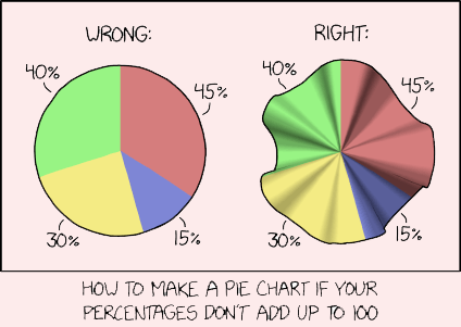
Fortunately there is a simple remedy for re-educating people who misuse pie charts.