

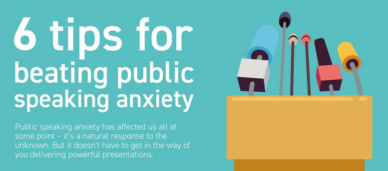
At BOSS magazine round this February 12th there was an article titled 6 Tips for beating public speaking anxiety that ended with an infographic from the British presentation design firm Buffalo 7. The infographic originally appeared on May 25, 2016 in another article at their web site titled as How to overcome presentation anxiety. Those tips were Nerves = Positive Energy, Perfect Your Intro, Use Deliberate Breathing, Don’t Rush – Take Your Time, Keep Movin’ On, and Use Body Language to Tour Advantage. The background in that infographic alternated between light green and bright blue and, but all the body text was white. Small white text on a light green background is nearly unreadable, as is shown above for just the very top of that infographic. Either that text should have been black (I changed the words speaking anxiety as an example), or the background should have been darker.
At Dave Paradi’s Think Outside The Slide web site there is a
page with a Color Contrast Calculator for avoiding that graphical travesty of pretty
but unreadable design.
At Entrepreneur on October 27, 2018 there was an article by Matthew McCreary titled 6 easy tips for conquering your fear of public speaking (infographic), which had another infographic version with a darker blue background, as is shown above.
No comments:
Post a Comment