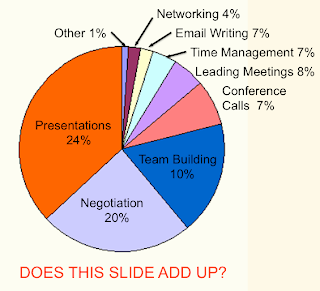
Yesterday on the Business Presentation Clinic blog I saw a post titled This Pie Chart Needs Rescue with a chart similar to the one shown above. One of the problems with this chart is that it displays nine different categories, while a pie chart is only effective for up to about five categories.
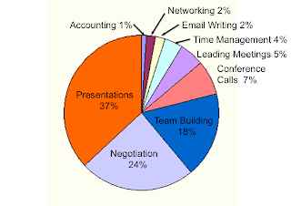
However, what struck me first was that the numerical labels on the chart shown above don’t match with their wedge angles. The largest category, Presentations, is labeled as being 24%, so that angle should be slightly less than 90 degrees. Instead it is much greater, more than 120 degrees. When you add up the nine numbers shown on the labels, you get a total of only 88%. The first kind of rescue that this chart needs is a look at the original data table to find the correct percentages that add to 100%. When you label the percentages correctly you get the following bar chart:

They went on to fix the problem of having too many categories with a revised pie chart (their Chart A) showing just the three largest categories, and grouping the other six into a fourth category marked Other (and then detailed in a table to the right of the pie chart).
They also displayed the data in three other ways: a stacked bar chart (Chart B), a bar chart (Chart C), and a column (vertical bar) chart (Chart D). I think that the bar chart is the best way for displaying all the data while emphasizing what is most important. All of the bars start from a common origin, so it is easy to compare their magnitudes. For the stacked bar chart they also added an table detailing the Other category. The column chart is unsatisfactory for presenting on a screen because the labels are vertical. You shouldn’t have to rotate your head to read. I really liked that all their revisions had headlines stating that The Majority of Our Employees Need Presentation Skills Training rather than Training Needs from Global Employees.
In a previous post I said that Pie charts do not speak clearly; they just mumble. In that post I referred to a 14-page newsletter article by Stephen Few from 2007 about why you should just Save the Pies for Dessert. He points out that:
“Because the pie chart was difficult to read, we added values so we wouldn’t have to compare the sizes of the slices and we added direct (company) labels so we wouldn’t have to rely on a legend. We turned the pie chart into an awkwardly arranged equivalent of a table of labels and values.”
When the bar chart can stand by itself, why bother with using a pie chart with labels (or a stacked bar chart plus a table)? Why not use either a chart or a table, and avoid straying somewhere in-between?
2 comments:
Richard,
This pie chart reminds me of how it's so easy for us to fall in love with the data that we've exhaustively collected.
It's easy to be tempted to show it all off -- in the most complex manner possible -- so everyone can see just how smart we are.
Unfortunately, it just overwhelms people, and it can hinder rather than help us from making our point.
Here's to simpler ways to present data in 2011!
Often it is best to show a top five, and leave the details to a handout. Sometimes, like here I show both.
Post a Comment