Showing posts with label graphics. Show all posts

Sunday, April 20, 2025

A controversy about Boise displaying a pride flag at City Hall


Flying a flag is a graphical form of speech. You would expect conservatives to want that speech to be free. But that’s not what the Idaho legislature did during this session. There is an article by Kyle Pfannenstiel at the Idaho Capital Sun on February 18, 2025 titled Idaho bill limiting types of flags state, local governments can display passes House.


Our legislature passed House Bill 96, which limited what flags government entities (the state, a county, municipality, special district or other political subdivision) can fly. The only flags allowed are: the United States flag, the official flag of a government entity, official flags of any U.S. state, the POW/MIA flag, and official flags of Indian tribes. Curiously these restrictions do not apply to schools, colleges, or universities.


There is another article by Greg Pruett at the Idaho Dispatch on April 13, 2025 titled Day 10: McLean Stands Firm Against Removal of LGBT flag. Besides the Dispatch he runs the Idaho Second Amendment Alliance (also see this Idaho Voters article).


Yet another article by Richard Rodriguez at KTVB7 on April 15, 2025 is titled Idaho Attorney General urges Boise Mayor to remove pride flag. He noted that:


“…during legislative debate that the bill appeared targeted specifically at Boise, as examples presented during hearings focused exclusively on pride flags displayed in the capital city….


Meanwhile, Bonners Ferry in northern Idaho continues to fly a Canadian flag outside its City Hall.”  


There is a press release by Raul Labrador on April 15, 2025 titled Attorney General Labrador Asks Boise Mayor to Comply with State Law. In it he noted:


“...Although there is no express criminal or civil penalty provided for in this statute, you should comply with the law out of a sense of duty to your oath of office. As Idaho’s Attorney General, I ask that you reconsider your defiance of this duly enacted law and remove all prohibited flags.”


A statute without a penalty really is quite silly.


An image of Boise flags came from here at Instagram.


Tuesday, April 15, 2025

Factfulness is a wonderful book regarding how to think about the world


Hans Rosling (1948 to 2017) was a Swedish physician. He gave a TED talk in 2014 with his son Ola on How not to be ignorant about the world. There is another 2007 TED talk titled The best stats you’ve ever seen | Hans Rosling.


There also is a wonderful 2018 book by Hans Rosling, with Ola Rosling, and Anna Rosling Roennlund titled Factfulness: Ten reasons we’re wrong about the world – and why things are better than you think. It has a Wikipedia page too. They discuss ten instincts which can distort our perspective. In March 27, 2025 I blogged about one chapter in a post titled There may be no warning before as disaster.


 There are eleven chapters in the book, ten of which end with as summary as follows:


“Chapter 1 [page 46]: To control the gap instinct, look for the majority.


Beware comparisons of averages. If you could check the spreads you would probably find they overlap. There is probably no gap at all.

Beware comparisons of extremes. In all groups, of countries or people, there are some at the top and some at the bottom. The difference is sometimes extremely unfair. But even then the majority is usually somewhere in between, right where the gap is supposed to be.

The view from up here. Remember, looking down from above distorts the view. Everything else looks equally short, but it’s not.


Chapter 2 [page 74]: To control the negativity instinct, expect bad news.


Better and bad. Practice distinguishing between a level (e.g., bad) and a direction of change (e.g. better). Convince yourself that things can be both better and bad.

Good news is not news. Good news is almost never reported. So news is almost always bad. When you see bad news, ask whether equally positive news would have reached you.

Gradual improvement is not news. When a trend is gradually improving, with periodic dips, you are more likely to notice the dips than the overall improvement.

More news does not equal more suffering. More bad news is sometimes due to better surveillance of suffering, not a worsening world.

Beware rosy pasts. People often glorify their early experiences, and nations often glorify their histories,


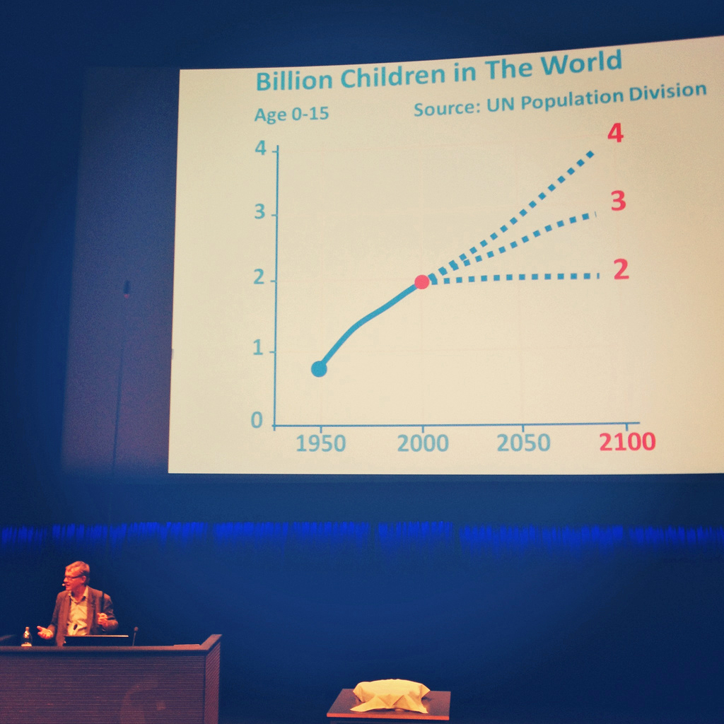
Chapter 3 [page 100]: To control the straight line instinct, remember that curves come in different shapes. [See the image shown above].


Don’t assume straight lines. Many trends do not follow straight lines, but are S-bends, slides, humps, or doubling lines. No child ever kept up the rate of growth it achieved in its first six months, and no parents would expect it to.


Chapter 4 [page 123]: To control the fear instinct, calculate the risks.


The scary world: fear vs. reality. The world seems scarier than it is because what you hear about it has been selected – by your own attention filters or by the media – precisely because it is scary.

Risk = danger x exposure. The risk something poses to you depends not on how scared it makes you feel, but on a combination of two things. How dangerous is it? And how much are you exposed to it.

Get calm before you carry on. When you are afraid, you see the world differently. Make as few decisions as possible until the panic has subsided.


Chapter 5 [page 143]: To control the size instinct, get things in proportion.


Compare. Big numbers always look big. Single numbers on their own are misleading and should make you suspicious. Always look for comparisons. Ideally, divide by something.

80/20. Have you been given a long list> Look for the few largest items and deal with those first. They are quite likely more important than all the others put together.

Divide. Amounts and rates can tell very different stories. Rates are more meaningful, especially when comparing between different-sized groups. In particular, look for rates per person when comparing between countries or regions.


Chapter 6 [page 165]: To control the generalization instinct, question your categories.


Look for differences within groups. Especially when the groups are large, look for ways to split them into smaller, more precise categories. And…

Look for similarities across groups. If you find striking similarities between different groups, consider whether your categories are relevant. But also…

Look for differences across groups. Do not assume that what applies for one group (e.g. you and other people living on Level 4 or unconscious soldiers) applies to another (e.g. people not living on Level 4 or sleeping babies.

Beware of ‘the majority.’ The majority just means more than half. Ask whether it means 51 percent, 99 percent, or something in between

Beware of vivid examples. Vivid images are easier to recall but they might be the exception rather than the rule.

Assume people are not idiots. When something looks strange, be curious and humble, and think. In what way is this a smart solution?


Chapter 7 [page 184]: To control the destiny instinct, remember slow change is still change.


Keep track of gradual improvements. A small change every year can translate to a huge change over decades.

Update your knowledge. Some knowledge goes out of date quickly. Technology, countries, societies, cultures, and religions are constantly changing.

Talk to Grandpa. If you want to be reminded of how values have changed, think about your grandparents’ values and how they differ from yours.

Collect examples of cultural change. Challenge the idea that today’s culture must also have been yesterday’s, and will also be tomorrow’s.


Chapter 8 [page 202]: To control the single perspective instinct, get a toolbox, not a hammer.


Test your ideas. Don’t only collect examples that show how excellent your favorite ideas are. Have people who disagree with you test your ideas and find their weaknesses.

Limited expertise. Don’t claim expertise beyond your field: be humble about what you don’t know. Be aware too of the limits of the expertise of others.

Hammers and nails. If you are good with a tool, you may want to use it too often. If you have analyzed a problem in depth, you can end up exaggerating the importance of that problem or of your solution. Remember that no one tool is good for everything. If your favorite idea is a hammer, look for colleagues with screwdrivers, wrenches, and tape measures. Be open to ideas from other fields.

Numbers, but not only numbers. The world cannot be understood without numbers, and it cannot be understood with numbers alone. Love numbers for what they tell you about real lives.

Beware of simple ideas and simple solutions. History is full of visionaries who used simple utopian visions to justify terrible actions. Welcome complexity. Combine ideas. Compromise. Solve problems on a case-by-case basis.  


Chapter 9 [page 222]: To control the blame instinct, resist finding a scapegoat.


Look for causes, not villains. When something goes wrong don’t look for an individual or a group to blame. Accept that bad things can happen without anyone intending them to. Instead spend your energy on understanding the multiple interacting causes, or system, that created the situation.

Look for systems, not heroes. When someone claims to have caused something good, ask whether the outcome might have happened anyway, even if that individual had done nothing. Give the system some credit.


Chapter 10 [page 242]: To control the urgency instinct, take small steps.


Take a breath. When your urgency instinct is triggered, your other instincts kick in and your analysis shuts down. Ask for more time and more information. It’s rarely now or never and it’s rarely either/or.

Insist on the data. If something is urgent and important, it should be measured. Beware of data that is relevant but inaccurate, or accurate but irrelevant. Only relevant and accurate data is useful.

Beware of fortune-tellers. Any prediction about the future is uncertain. Be wary of predictions that fail to acknowledge that. Insist on a full range of scenarios, never just the best or worst case. Ask how often such predictions have been right before.

Be wary of drastic action. Ask what side effects will be. Ask how the idea has been tested. Step-by-step practical improvements, and evaluations of their impact, are less dramatic, but usually more effective.”


The image of a chart on children came from Wikimedia Commons.


Sunday, April 13, 2025

Making a huge mural from all your fears


Brian Rea is an illustrator who was interviewed by Emma Tucker at Creative Review on November 18, 2020 in an article titled How I Got Here: Brian Rea:


“I had this crazy sense of a white noise of anxiety in my life, where I was feeling anxious and couldn’t quite figure it out. I started keeping a list of all the things that were making me anxious and nervous, like a mind-mapping of feelings and emotions. That list ended up becoming a reference point for a lot of other work. I did a mural based on it in Barcelona, and I’ve gone on to do paintings based on happiness, love, beauty and anger, and all these other topics. For me it’s a different way of telling a story.”


That mural is 11.5 feet high and 23 feet wide. It is described by Alissa Walker in another article at Fast Company on March 1, 2010 titled Fear Not These Murals: Brian Rea’s Art Is What Keeps Him Up at Night. Just the first image of a section from it shows us the following 38 fears:


“Atlantis, bad trips, banged head, bigfoot, bird droppings, carnivals, child abduction, chupacabra, contaminated food, crop circles, dreams, drive by shooting, earthquake, eye poke, fall through ice, falling objects from very tall buildings, falling scaffold, falling tree, false imprisonment, farm runoff, fights, frostbite, hit by bus, hit by pitch, humidity, hurricane, mad cow disease, moose attack, night visitors, prophecies, spilled ink, striking out, sucker punch, swamps, tampered food, tele-marketers, volcano, water balloon.”


A second mural just is about UFOs.


Darwin’s image of terror from his book on The Expression of the Emotions in Man and Animals was colorized from one found at Wikimedia Commons.


Monday, March 31, 2025

According to a Pearls Before Swine cartoon there are four groups of people


On January 19, 2024 I blogged about The joy of 2x2 tables, or charts, or matrixes. The Pearls Before Swine cartoon by Stephen Pastis for March 30, 2025 has a line drawing of the graphic shown above (without axis labels), and the following dialogue:


Pig: Oh, great Wise Ass, help me to understand humanity.


Wise Ass: Of course, my son… All people can be classified into one of four quadrants which look like this…


Wise Ass: We love Group(A), tolerate Group(B), and pity Group(C).


Pig: That all sounds good, but what about Group(D)? The Dumb and Arrogant.


Pig: I know who’s been running our lives.


Monday, January 6, 2025

Another misleading article about government spending from the Idaho Freedom Foundation


At the Idaho Freedom Foundation on December 31, 2024 there is a misleading article by Fred Birnbaum titled Want limited government? Control the spending! He preaches that:


“Legislative leadership needs to set both state and federal (all funds) spending limits so that overall spending does not grow at all in the coming year, meaning a 0% increase in all funds appropriations from Fiscal Year 2025 to Fiscal Year 2026. Is this reasonable? Absolutely!


Fred has a pair of tables showing how state spending grew from fiscal 2020 to 2025, and how federal spending changed from fiscal 2019 to 2024. He shows a totally unnecessary seven or eight significant figures. Graphs would have been more effective for showing changes. Fred claims that there have been large increases:


“What we see is that state spending, excluding federal dollars, has increased 53% over five years at a compound annual growth rate (CAGR) of 8.8%. Now let’s look at the federal dollars (all federal spending, not just federal dollars for Idaho) for the last five years – note that a one-year offset is used because of differences in fiscal years and the fact that COVID spending first washed through the federal government before hitting the states.

What we see is that federal spending is up 56%, and the CAGR is 9.3%. This means that Idaho is growing spending virtually as fast as the profligate federal government. Who would have thought this?”


Fred summarized those tables with a five-year % increase and a CAGR. But what was going on from year to year?


The graph shown above made using Excel displays the state spending data. Year to year % increases in spending were 4.75%, 4.64%, 18.6%, 11.5%, and 5.35%. The first two were around 5%, but the next two were much larger. The five-year % increase was 53% and the CAGR was 8.8%.


Another graph shows the federal data he tabulated in red. Year to year % changes in spending were 47.4%, 4.1%, -8.0%, -2.2% and 13.1%. The five-year % increase was 56% and the CAGR was 9.3%. With a huge range of -2.2% to 47.4% the CAGR tells us very little. But Fred did not link to a source for that federal data, so I went looking for one. I found a United States Treasury Department FiscalData web page titled How much has the U.S. government spent this year? which has a graphic titled Government Spending and the U. S. Economy (GDP, FY 2015 -2024 Inflation Adjusted – 2024 dollars. I also have plotted that federal data in blue. It does NOT agree with what Fred tabulated. The five-year % increase only was 23.6% and the CAGR just was 3.9%. But the maximum change, from 2019 to 2020, was by 45.4%. Using the five-year % increase gives a much more modest change of 23.6%, where Idaho spending increased over twice as much as federal spending did!


That Treasury web page has more spending data, back to 2015. All those results are shown above in yet another graph. We can look at 2020, 2021, and 2022 as being a COVID-19 hump. Then we can draw a line with a 5% growth rate through 2018, 2019, 2023 and 2024. A 5% growth rate would compensate for inflation and be much more reasonable than Fred’s zero.   


The cartoon with money bags was adapted from this one at Openclipart.


Monday, December 30, 2024

Molly Graham shares an interesting message - that career stairs are just an illusion


I saw a good article by Maurice DeCastro at Mindful Presenter with an iconic visual on December 5, 2024 titled Molly Graham’s TED talk shares an interesting message, “The stairs are an illusion.” He embeds the nine and a half minute TEDNext video, titled Forget the Corporate Ladder – Winners Take Risks | Molly Graham | TED that also can be found at YouTube. Molly advises you to get good at three things:


actually jumping off the cliff [4:20]

surviving the fall [5:21]

becoming a professional idiot [6:33]


I modified an image of some illusory Penrose stairs from Openclipart.


Tuesday, November 5, 2024

What mix of happiness and unhappiness do you have?


Recently I have been reading the 2023 book by Arthur C. Brooks and Oprah Winfrey titled Build the Life You Want: The Art and Science of Getting Happier. (There is a brief preview at Google Books). On page 14 they explain that:


“We all have our own natural mix of happiness and unhappiness, depending on our circumstances and character, and our job is to use the mix we’re given to best effect. The first task in doing that is learning where, in fact, we are.


One way to get evidence of your natural happy-unhappy mix is by measuring your levels of positive and negative affect – mood – and how they compare to others’ using the Positive and Negative Affect Schedule, or PANAS.”


That schedule is described by Brooks in a pdf article titled LESSON TOPIC: Positive Affect and Negative Affect. (There also is a Wikipedia page). You rank twenty different emotions on a scale from one to five where 1 = very slightly or not at all; 2 = a little; 3 = moderately; 4 = quite a bit; and 5 = extremely.


And on pages 16 to 18 of the book they elaborate that:


“Unless you are the highly unusual person who is right at the average on both positive (about 35) and negative (about 18), you will fall into one of four quadrants, as illustrated in Figure 1. If you have above-average positive affect and above-average negative affect, you’re one of the ‘Mad Scientists,’ who are always spun up about something. If you’re below-average positive and below-average negative, you’re a sober and cool ‘Judge.’ ‘Cheerleaders,’ with above-average positive and below-average negative, celebrate the good in everything and don’t dwell on the bad. ‘Poets,’ who register below-average positive and above-average negative, have trouble enjoying good things, and always know when there is a threat lurking.


We know, we know: you wish you were in the cheerleader quadrant. But we can’t all be cheerleaders, and the world needs the other profiles as well. On a moment’s reflection, you’ll likely realize that it would be a nightmare if everyone saw only the bright side of everything, because we’d keep making the same mistakes again and again. Poets are valuable for their perspective and creativity. (And everyone looks great in a black turtleneck.) Life is more interesting with Mad Scientists in the mix. And Judges keep us all from blowing ourselves up with impulsive ideas.


You have a unique role to play in life. Your profile is a gift. But no matter what that profile is, you have room to increase the happiness in your life. To do that, you have to understand your natural happiness blend, manage yourself, and then play to your strengths. For example, let’s say you are a Mad Scientist. You will tend to react very strongly, good and bad, to things in your life. This might make you the life of the party, but it can exhaust your loved ones and coworkers. You need to know this, and work to manage your strong emotions and reactions.


Maybe you are a Judge. You are cool as a cucumber, and perfect for jobs like surgeon or spy (or anything in which keeping your head is an advantage – like raising teenagers). But with friends and loved ones, you might seem a little too unenthusiastic at times. This knowledge can be useful so that you work to muster a little more passion than comes naturally, for the sake of others.


Or perhaps you are a Poet. When everyone says everything’s great, you say, ‘Not so fast.’ This is important, because it can literally or figuratively save lives – Poets see problems before others do. But it can make you pessimistic and hard to be around at times, and you can tend toward melancholy. You need to learn how to brighten up your assessments and not catastrophize.


Even a Cheerleader needs emotional self-management. Everyone loves being a Cheerleader, but keep in mind that you will probably avoid bad news and have a hard time delivering it. That’s not always a good thing! You will need to work on that so you can give people the truth, see things accurately in life, and not say everything is going to be all right when it just isn’t true.


Learning your PANAS profile – your natural blend of happy and unhappy feelings- can help you get happier because it indicates how to manage your tendencies, but in separating the two sides, it also points out vividly that your happiness does not depend on your unhappiness. The PANAS test is empowering, because using it, many people understand themselves for the first time, and see that there is nothing weird or wrong with them. For example, some people go for many years thinking they are defective because they experience more negative feelings than others around them, and have a hard time mustering as much enthusiasm as others. They learn that they are simply Poets. And the world needs Poets.”  


On January 19, 2024 I blogged about The joy of 2x2 tables, or charts, or matrices.


The cartoon was adapted from one at Openclipart.


Saturday, August 17, 2024

First look at the data, then look at the words


Via interlibrary loan, I recently got a 2024 book by Hasan Merali titled Sleep Well, Take Risks, Squish the Peas and subtitled Secrets from the Science of Toddlers for a Happier, More Successful way of Life. On page 58 he intriguingly says:


“One of the sad parts of getting older is that we all go over what has been termed the ‘humor cliff.’ A 2013 Gallup study of 1.4 million people in 163 different countries showed that the amount we smile and laugh starts to fall dramatically at age twenty-three. It does start to rise again but not until age eighty, and it never reaches the peak we started at.” Ref. 4, 5


Reference 5 is an August 2021 TED talk by Jennifer Aaker and Naomi Bagdonas: Why Great Leaders Take Humor Seriously | TED. They discuss the global humor cliff:


“Here’s the problem though. We’ve all fallen off a humor cliff. In a global study, over a million people were asked a simple question – did you smile or laugh a lot yesterday? When we’re kids the answer is yes. Then, right when we enter the work force, the answer becomes no. The good news is things look up again around 80. The bad news is the average life expectancy is 78.”


And they have a graph at the one-minute mark, which I have shown above with annotations. But their words and their graph disagree. A transition between yes and no logically would occur at 50% (my dashed red line at the bottom), but their blue line always is above 60%. If the transition was at 75%, then their statement would make sense. Instead, when we enter the work force the slope decreases. This problem should have been caught in the first rehearsal where the graphic was used.


That TED talk was preceded by a 2021 book by Jennifer Aaker and Naomi Bagdonas titled Humor, Seriously: Why Humor is a Secret Weapon at Work and in Life. Their discussion of The Humor Cliff on page 22 has a two-and-a-half-inch tall line drawing just like the TED talk and above it says:


“The collective loss of our sense of humor is a serious problem afflicting people and organizations globally. We’re all going over the humor cliff together, tumbling down into the abyss of solemnity below.


At the bottom of that abyss, we’re joined by the majority of 1.4 million survey respondents in 166 countries who revealed in this Gallup poll that the frequency with which we laugh or smile each day starts to plummet around age 23.”


That discrepancy also should have been caught during proofreading of the book.


There is an article by Reed Tucker at the New York Post on March 13, 2021 titled We start losing our sense of humor at age 23 – and it could wreck your career. It has a graphic with a detailed caption saying:


“THE HUMOR CLIFF

Studies show that people laugh freely and openly when young, but less so as they age, starting around 23. The laughter tends to return, however in the twilight year – perhaps as we work less and spend more time with loved ones.”


My annotated version of the graphic is shown above. The article title accepts the age 23 claim from the book without looking at what the data in the graph reveals. We really start losing our sense of humor at age 13. It drops from 83.4 percent at age 13 to 73.6% at age 25 - at a rate of 0.82% per year. Then from age 25 to 50 it drops more slowly at a rate of 0.22% per year to 68.1% at age 50. There also is a small peak of 68.6% at age 58. It drops at 0.3% per year from age 58 to age 83 The minimum is 61% at age 83, and then it rises again to 72% at age 100.


A Toastmasters International web page about Visual Aids and Props warns us that:


“Diagrams, graphs and charts should always coincide with what is being said in the speech.” 


We should first look at the data, and then look at the words to see that they match.


Wednesday, June 5, 2024

Using a graphic to make a quote memorable – or not


As shown above, you can use a graphic to help make a quote memorable. I could not find who M. Rose is (Mr. or Ms.?), and where he or she supposedly said that, but after 2015 when it was claimed that:


You will never forget a person who came to you with a torch in the dark.”


Last week I saw another image for it, previously at Instagram. It had been posted by Tony DeMeo a week ago at the LinkedIn Public Speaking group. But there were two things wrong there. First, the image showed a person with a lantern rather than a torch. Second, the word person was misspelled as peson. That typo made it less memorable.  


The torch image was adapted from a Pearson Scott Foresman drawing at Wikimedia Commons.


Friday, January 19, 2024

The Joy of 2x2 tables, or charts, or matrixes


2x2 graphics are very useful for all sorts of planning. They are the next level beyond a one-dimensional description where typically ‘more is better.’ On July 3, 2020 I blogged about Is that 2x2 graphic a table, a chart, or a matrix? Should the axis go from left to right or right to left? And then on July 5, 2020 I blogged about Is that 2x2 graphic a chart, or a matrix? How many quadrants are there?


More recently, starting on November 13, 2023 I blogged about many different 2x2 graphics, as are shown above. If you want to learn much more, then look at a 348-page book from two decades ago (2004) by Alex Lowy and Phil Hood titled The Power of the 2x2 Matrix: Using 2x2 thinking to solve business problems and make better decisions.


How can you decide when you need a 2x2 chart? As shown above, there is a 2x2 chart for that from Jeremiah Owyang at flickr on November 12, 2009 titled Matrix: Do You Need a 2x2 Matrix. The Magic 8 Ball is discussed in a Wikipedia page. It contains a floating icosahedron that has 20 answers, ten affirmative, five negative, and five non-committal.


Thursday, January 18, 2024

A cost versus value 2x2 chart for project management


At a web site by Nils Davis for his book, The Secret Project Manager Handbook, there is an article titled The prioritization 2x2 that is the first in a series titled How to Prioritize: Top 6 Prioritization Techniques. He shows a cost vs. value 2x2 chart (low and high) with cost as the horizontal axis, and value as the vertical axis – as shown above. The two blue boxes (which I connected by an arrow) have the normal sequence (blue) where low cost goes with low value and high cost with high value. The upper left green box (low cost and high value) is an excellent surprise, but the lower right red box (high cost and low value) is something to avoid. 


At Savio there is another article by Kareem Mayan titled What is the Value vs Effort Matrix? Explanation, guide and how to avoid its pitfalls. As shown above, he plots value on the value horizontal axis and more generally effort (like cost) on the vertical axis. He discusses five weaknesses for this approach:


We’re not good at estimating value.

We tend to underestimate effort

Some features are important even if they won’t provide value.

Scores aren’t static.

Doesn’t directly tie scores to customer needs.


Tuesday, January 16, 2024

SWOT analysis is a strategic planning and management tool using a 2x2 chart


Strength, Weaknesses, Opportunities, and Threats (acronym SWOT) is a tool for strategic planning and management using a 2x2 chart, as shown above. There is a succinct three-page pdf article about it at the American Academy of Nurse Anesthesiology, and a Wikipedia page.


Also, there is another  longer article by Joseph Ferriolo at WiseBusinessPlans on November 29, 2023 titled SWOT Analysis: What it is and how to do it correctly with examples. Finally, there is a 33-page e-book you can download for free as a pdf from West Virginia University titled SWOT Analysis – strategy skills.


Monday, January 15, 2024

A 2x2 crosshairs pie chart describing four realms for how people process experience


I have been reading the 2023 book by James C. Maxwell titled The 16 Undeniable Laws of Communication. On page 117, in a section of the sixth chapter titled Put the Body on the Bones, he displays a 2x2 crosshairs pie chart from another book, which is shown above in my colorized version. The text says that:


“B. Joseph Pine II and James H. Gilmore, who wrote The Experience Economy, describe the way people process experiences based on whether they are active or passive and whether they ‘absorb’ the experience or are immersed in it. They describe what they call the four experience realms: entertainment, educational, escapist, and esthetic…  


Entertainment occurs when people passively absorb the experience, such as watching a concert or reading a book. An educational experience also focuses on absorbing an experience, but in addition, the participants are actively engaged in mind, body, or both. People learning skills in a classroom or on a field learning to play soccer have this experience. An escapist experience is both immersive and active, such as when people visit theme parks, gamble in casinos, or play computer games. Esthetic experiences are immersive but passive, leaving no physical effect on their environment. Examples include gazing at the Grand Canyon or viewing an art exhibit.


…The richest experiences encompass aspects of all four realms. These center on the ‘sweet spot’ in the middle of the framework.”


Those four realms of experience also are in the earlier, 1999 book, titled The Experience Economy – Work Is Theatre and Every Business a Stage.


And they began with an article by Pine and Gilmore in the July August 1998 issue of the Harvard Business Review titled Welcome to the Experience Economy. But, back then, as shown above in my colorized version, the graphic was a donut chart rather than a pie chart. That was despite stating:


“Generally, we find that the richest experiences—such as going to Disney World or gambling in a Las Vegas casino—encompass aspects of all four realms, forming a ‘sweet spot’ around the area where the spectra meet.”