Showing posts with label numbers. Show all posts

Monday, August 25, 2025

This blog had another gigantic spike in page views


Occasionally this blog has a spike in page views. As shown above, the latest gigantic one with 32,316 page views occurred on August 21, 2025.


Another chart for all time (really just for most time), shown above, reveals a peak of 110,170 page views for the month of June, shown as 6/30/25. Note that there has been a total of 2,929,093 million page views. There have been 2,940 posts, so the average is 996 views per post or roughly a thousand.


Back on December 23, 2024 I blogged about How should we present a huge number like the two billion dollars earned by the Taylor Swift Eras tour? In an December 28, 2024 update I noted a peak of 5,231 page views. And on September 1, 2023 I blogged about how On August 26, 2023 this blog had a gigantic spike in page views with 27.6 times the annual average. That day there were 12,295 page views.


I belong to the Pioneer Toastmasters club in Boise, Idaho which has 28 members. On August 21, 2025 over a thousand times the number of my club members viewed my blog.  


Wednesday, August 6, 2025

Two very useful articles in the August 2025 issue of Toastmaster magazine on Five Tips for Depicting Data and Making Your Data Presentations Come to Life


The August 2025 issue of Toastmaster magazine has two very useful articles. One by Florian Bay on pages 20 to 23 is titled 5 Tips for Depicting Data and subtitled How to use numbers and graphs to create a compelling story. His five headings are:


Be Clear on Your Purpose

Select the Right Visual

Remove the Clutter

Engage with Colors but Don’t Create Rainbows

Use Text to Guide Your Viewers


The first two line and column bar charts, at the bottom of Page 20 are missing a label for the vertical axis, which should be Number of UNESCO Sites. As shown above, I have added it in red.


Regarding pie charts, he says:


“Visualizing proportions? Then use a pie chart, but only if you’ve got two or three slices to share; any more than that and the proportions get hard to interpret. Stacked bar charts can also be useful.”


I don’t think pie charts ever are useful, as I discussed in a blog post on September 16, 2008 titled Pie charts do not speak clearly; they just mumble and one on July 29, 2022 titled Is there any excuse for using a pie chart?


And his example with Yearly Passengers in London Heathrow Airport 2005-2024 (shown above) has the numbers of years shown vertically rather than horizontally. My Excel version omits the bullseyes around the pandemic data and just shows numbers for all those data points. (On July 4, 2017 I blogged about Why is your audience tilting their heads sideways?)


The second article by Charlene Phua following on pages 24 and 25 is titled Make Your Data Presentations Come to Life and subtitled Avoid these 4 missteps to ensure your audience stays engaged. Her four headings are:


Including data that isn’t relevant to topic or audience

Having an inaccurate gauge of your audience’s understanding

Providing data with no context or comparison

Neglecting other aspects of your performance


For the third she uses the example of annual global carbon dioxide emissions. She didn’t mention a number, but in 2022 they are 38,521,997,860 tons. We can ask What’s in it for me? The global Population is  8,021,407,192 people so it is 4.802 tons per capita, or 9605 pounds. Per day it is 26.3 pounds, and converting that to a cube of dry ice, it is one 7.75 inches on a side, as shown above.


On December 23, 2024 I blogged about How should we present a huge number like the two billion dollars earned by the Taylor Swift Eras tour? And on July 12, 2016 I blogged about How to make statistics understandable. Also, on August 17, 2011 I posted on How to make a large number incomprehensible or comprehensible and on July 15, 2011 I blogged on What can we say about a really big hole in the ground?


Tuesday, July 29, 2025

Disinformation from the Gem State Patriot News


There is a post from Bob ‘Nugie’ Neugebauer at the Gem State Patriot News blog on July 27, 2025 simply titled Disinformation. The third sentence in his last paragraph says that:


“You will not find any disinformation in our newsletter and if you ever should we ask that you please let us know where we have gone wrong.”


But I already tried to do that, and was rejected. In a previous post on June 22,2025 titled Idaho Faces Growth and Ideological Challenges the fourth paragraph began by claiming that:


“Our nation’s welfare system represents a catastrophic failure that has entrenched poverty rather than eliminating it. Since Lyndon Johnson’s Great Society programs, poverty rates have remained frozen around 15% instead of continuing their post-World War II decline.”


I discussed that claim in a post on June 25, 2025 titled The U.S. poverty rate has not been ‘Frozen around 15%’ since the Great Society. As shown above, from 1990 to 2023 it had moved up to 15.1% and down to 10.5%.  And I sent Mr. Neugebauer the following comment:


“Bob:


You are quite wrong about the rate for poverty. The only time the poverty rate was ‘frozen’ at around 15% was between 2010 and 2014. It was ‘frozen’ at 12.6% from 2003 to 2005 and at 11.5% from 2020 to 2022. In 2019 (under Trump) the poverty rate had fallen to 10.5%, which is 4.5% lower than the 15% you cited. Clearly you don’t know what you are talking about. For details see a post at my Joyful Public Speaking blog on June 25 titled The U.S. poverty rate has not been ‘Frozen around 15%’ since the Great Society.”


He rejected it and never posted that comment on his blog.


Wednesday, July 23, 2025

Use relatable units when reporting numbers


On October 13, 2024 I blogged about Chopping a number down to size by using the right unit conversion. In that post I noted that the federal government web site reports wildfires in units of acres. That’s hard to grasp if the fire covers thousands of them. There are 640 acres to a square mile, so sizes for larger fires instead should be shown in square miles, and not acres.


On July 19, 2025 there is an article by Nicole Blanchard at the Idaho Statesman titled Car on fire sparks 8,000-acre wildfire along I-84 near Boise on Saturday. A bit later that day there is another article by Barclay Idsal and Allie Triepke at IdahoNews6 titled 8,902 acre wildfire ongoing southeast of Boise leads to low visibility along I-84. 8902 acres converts to 13.91 square miles, or a square with 3.73 miles on a side (as is shown above).


That MM65 I-84 Fire is just east of the Blacks Creek Road exit (Exit 64) for I-84. If I plan to go east on I-84, then I commonly avoid east Boise traffic by going south on the ironically-named Pleasant Valley Road past the state prisons, and then east on Kuna Mora Road to reach Exit 64.    


Wednesday, June 25, 2025

The U.S. poverty rate has not been ‘Frozen around 15%’ since the Great Society


Sometimes just a little research reveals that a political pundit doesn’t know what he’s talking about. A post by Bob ‘Nugie” Neugebauer at the Gem State Patriot News blog on June 22, 2025 titled Idaho Faces Growth and Ideological Challenges claims:


“Our nation’s welfare system represents a catastrophic failure that has entrenched poverty rather than eliminating it. Since Lyndon Johnson’s Great Society programs, poverty rates have remained frozen around 15% instead of continuing their post-World War II decline. This system rewards dependency by incentivizing single-parent households, discouraging marriage, and enabling able-bodied individuals to avoid work.”


Did he look that up or just borrow it from somewhere else? I found an article by Rachel Bade at Politico on September 17, 2013 including that headline. It is titled Pro Report, presented by POWERJOBS: Obama orders security revie – Navy cut security to reduce costs – U. S. poverty rate frozen at 15 percent – Uninsured rate declines. It says:


U.S. POVERTY RATE FROZEN AT 15 PERCENT. One-in-seven Americans still lived below the poverty line last year, several years out from the recession. (The poverty line, FYI is just over $23,400 for a family of four). That’s about the same as last year, and the sixth straight year without improvement, according to an AP analysis. Although the unemployment rate sank from 9.6 percent in 2010 to 8.1 percent last year, poverty didn’t, and that’s unusual, analysts say: ‘Typically, the poverty rate tends to move in a similar direction as the unemployment rate, so many analysts had been expecting a modest decline in poverty,’ AP’s Hope Yen writes.”


There also is a 2017 book by Jon H. Widener titled The Nexus: Understanding Faith and Modern Culture which says:


“In the US, the poverty rate was going down until President Lyndon Johnson began the War on Poverty in the 1960s. Since then the poverty rate has been frozen at 14 to 15 percent and has stayed there despite an outlay of $20 trillion over all those years and despite the continuing outlay of $1 trillion a year. The unabashedly collectivist Obama administration continued these policies during its eight years.”


Another article at Debt.org on December 21, 2023 titled Poverty in the United States has a section titled Poverty Levels Over Time which instead states:


“In the late 1950s the poverty rate in the U.S. was approximately 22%, with just shy of 40 million Americans living in poverty. The rate declined steadily, reaching a low of 11.1% in 1973 and rising to a high of nearly 15% three times – in 1983, 1993, and 2011 – before hitting an all-time low of 10.5% in 2019. However, the 46.7 million Americans in poverty in 2014 was the most ever recorded.”   


I looked up a detailed report by Robert D. Plotnik et al. of the Institute for Research on Poverty titled The Twentieth Century Record of Inequality and Poverty in the United States (Discussion Paper 1166-98 July 1998). Figure 3 on page 24 is shown above, with data for 1947 to 1996 (I added the times for the Great Society). Since those programs ended in 1968 the poverty rate ranged from 12% to 15% and never was frozen. In 1974 the rate hit a minimum of around 12%, 3% lower than the 15% cited by Mr. Neugebauer.


How about more recently? There is a web page by Abigail Tierney at statista on September 16, 2024 titled Poverty rate in the United States from 1990 to 2023. A replot of her graph is shown above. The only time the rate was ‘frozen’ at around 15% was between 2010 and 2014. It was ‘frozen’ at 12.6% from 2003 to 2005 and at 11.5% from 2020 to 2022. In 2019 (under Trump) the poverty rate had fallen to 10.5%, which is 4.5% lower than the 15% cited by Mr. Neugebauer. Clearly he doesn’t know what he’s talking about.


The 1883 Josh Shaw painting of empty pockets was adapted from Wikimedia Commons.  


Thursday, May 29, 2025

The first sentence in Donald Trump’s Truth Social Post on Memorial Day stated a number that was a million times too large


An article by Laerke Christensen at Snopes on May 27, 2025 is titled Fact Check: Trump’s Memorial Day Message. He began by claiming in all caps (my italics):


“HAPPY MEMORIAL DAY TO ALL, INCLUDING THE SCUM THAT SPENT THE LAST FOUR YEARS TRYING TO DESTROY OUR COUNTRY THROUGH WARPED RADICAL LEFT MINDS, WHO ALLOWED 21,000,000 MILLION PEOPLE TO ILLEGALLY ENTER OUR COUNTRY, MANY OF THEM BEING CRIMINALS AND THE MENTALLY INSANE,THROUGH AN OPEN BORDER THAT ONLY AN INCOMPETENT PRESIDENT WOULD APPROVE, AND THROUGH JUDGES WHO ARE ON A MISSION TO KEEP MURDERERS, DRUG DEALERS, RAPISTS, GANG MEMBERS, AND RELEASED PRISONERS FROM ALL OVER THE WORLD, IN OUR COUNTRY SO THEY CAN ROB, MURDER, AND RAPE AGAIN — ALL PROTECTED BY THESE USA HATING JUDGES WHO SUFFER FROM AN IDEOLOGY THAT IS SICK, AND VERY DANGEROUS FOR OUR COUNTRY.”


He meant instead to say 21 million, as was previously discussed by Simonne Shah and Leslie Dickstein in TIME on December 11, 2024 in another article titled Fact-Checking What Donald Trump Said in His 2024 Person of the Year Interview With TIME. The extra factor of a million raised the number to 21,000,000,000,000 – which is 21 trillion. But the world population only is about eight billion, so the number he said is quite absurd and a consequence of not having proofread.


Saturday, March 29, 2025

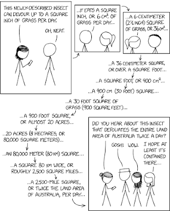
Square Units: an amusing comic strip at xkcd


At Randall Munroe’s xkcd webcomic on March 19, 2025 there is the comic about numbers shown above titled Square Units.


In it, a message about the area of grass devoured by an insect gets distorted each time it is passed on - as is graphically shown above.  


The Explain xkcd web page says that:


“In this comic, Megan is using her phone to read about an insect species that consumes (hyperbolically described as ‘devours’) one square inch of grass per day. As it is relayed through a chain of conversations, this measurement gets misinterpreted up to 12 times until Hairbun tells other people that it devours an area of grass equal to two times the land area of Australia per day….


This gross error is the result of repeatedly misinterpreting the number of square units as the side length of a square, thus increasing the described area by the power of two.”


 It’s a wild exaggeration of the old “Game of Telephone.”


The cartoon phone woman was adapted from OpenClipArt.  


Friday, March 14, 2025

An xkcd comic showing the breathtaking ranges for lifetime and mass covered by physics


On March 10, 2025 Randall Munroe’s xkcd web comic had the cartoon shown above titled Water Balloons. It uses two logarithmic scales to show a range of lifetimes in seconds from ten to the minus twentieth power to ten to twentieth power, and a range of masses in kilograms from ten to the minus thirtieth power to ten to thirtieth power. Wikipedia says a Logarithmic scale is:


“… a method used to display numerical data that spans a broad range of values, especially when there are significant differences between the magnitudes of the numbers involved.


Unlike a linear scale where each unit of distance corresponds to the same increment, on a logarithmic scale each unit of length is a multiple of some base value raised to a power, and corresponds to the multiplication of the previous value in the scale by the base value. In common use, logarithmic scales are in base 10 (unless otherwise specified).”


An article at Explain xkcd on March 10, 2025 describes this comic:


“The comic graphs the mass vs the lifetime of three objects: mesons, water balloons and planets. Mesons, which are subatomic particles, have a very low mass and a very short lifetime, as they naturally decay into other fundamental particles.


‘Flying water balloons’ are depicted as having a mass centered around 1 kilogram, but the area outlined covers a very broad range of mass (from grams to hundreds of kilos), and a lifetime centered around 1 second (but the area outlined covers from fractions of a second to a couple of hours), indicating the approximate amount of time that a water balloon is expected to be in the process of being thrown through the air. Not all water balloons break on impact, and they may be prepared well in advance, so specifying ‘flying’ indicates that it isn't the lifetime of the intact (and water-filled) balloon. Additionally, some are thrown directly into someone's face, thus their flight time would be extremely short, or non-existant if 'planted' before even being released.


Finally, planets have a very large mass and a very long lifetime, as they tend to exist for billions of years.”


Back on January 13, 2020 I blogged about How thin is “extremely thin”? I described using nine powers of ten in centimeters to step down from one (a finger) to ten to the minus eighth (an   atom).  


Saturday, January 25, 2025

Seeing data using exploratory data analysis and histograms


When I get bored, I play solitare – the online version from TheSolitaire.com. Recently I got curious about how much time and how many moves it was taking me to complete a game. What would the averages be? Would their shape just follow a Normal Distribution - the symmetrical bell curve shown above. It has roughly two thirds of the data (68.3%) in a range plus or minus one standard deviation from the mean.  


Or would there instead be a skew distribution, as shown above? I did some exploratory data analysis. I kept track of a hundred games, and then used Microsoft Excel to plot histograms.


A histogram for time to complete is shown above. The mean time to complete was 208 seconds (3 minutes and 28 seconds) and the standard deviation was 27.6 seconds.  Columns in this histogram are twenty seconds wide. There are roughly two and a half to the left of the mean, but four and a half to the right.


Another histogram, for the number of moves to complete, is shown above. The mean number of moves was 134 and the standard deviation was 12 moves. Columns in this histogram are ten moves wide. There are three to the left of the mean, but four to the right.  


Both histograms have a positive skew. They are shaped like the slide on a children’s playground, as shown above via a cartoon.


Monday, December 23, 2024

How should we present a huge number like the two billion dollars earned by the Taylor Swift Eras tour?


There is an interesting article by Carmine Gallo at Inc. on December 21, 2024 titled What Taylor Swift’s staggering tour numbers teach us about presenting data. He says:


“As you’ve probably heard, Taylor Swift has ended her two-year Eras Tour. Swift’s camp sent the final numbers to the New York Times, and the statistics are staggering: 149 shows over 21 months in 19 countries drew 10 million fans and generated just over $2 billion in ticket sales.”


And he notes that when compared with the previous biggest rock tour by Coldplay ($945 million) the Eras tour was more than twice as large. The AFL-CIO has a web page about the Highest paid CEOs 2023. At number one was Jon Winkelried of TPG who made $198.7 million – roughly a tenth of what the Eras tour earned.


Carmine makes another comparison:


“Swift’s longest engagement was a Wembley Stadium, where, over eight nights, she played for 750,000 people [an average of 93,750 per night]. That’s about the number of people who live in Seattle.”  


There is another article by Emma Keates at AVCLUB on December 9, 2024 titled Taylor Swift ends her Eras Tour era with $2 billion in earnings with more detailed numbers – a total of 10,168,008 attendees over 149 shows. That means each seat went for an average of $204. And over the whole tour there was an average of 68,242 people at each show.


 What is in it for me? The planet has a population of about 8.2 billion people, so we each paid Taylor an average of $0.24 – not quite a quarter. But to get a ticket ($204) those other folks paid 850 times more.


Back on July 12, 2016 I blogged about How to make statistics understandable.


Images of a quarter and a stack of dollars came from Openclipart.


UPDATE December 28, 2024


This post was featured in the LinkedIn Public Speaking group with 14,450 members, which led to the spike in page views shown as follows. 


Sunday, October 13, 2024

Chopping a number down to size by using the right unit conversion


On October 7, 2024 there is an article by Sally Krutzig at the Idaho Statesman titled Half of Boise Foothills wildfire contained as blaze reaches nearly 10,000 acres. It said the fire then covered an area of 9,892 acres. Those units are how our federal government reports fires, like on theirInciWeb site.


I think most people have difficulty visualizing a large number like 10,000. But we can chop it down. The Wikipedia article on an Acre says a square mile is 640 acres. That 9,892 acres converts to just 15.46 square miles. That’s a bit more than a 3 mile by 5 mile rectangle. And the much larger Lava fire west of Lake Cascade covers 97,585 acres or 152.5 square miles – corresponding to slightly more than a 10 mile by 15 mile rectangle.


What about even larger areas? Most of the country can think by comparison with the land area for our smallest state of Rhode Island (shown above on a U. S. map) - 1,034 square miles. Here in Idaho we could report it in terms of the land area for Ada County – a similar 1053 square miles.


Back on July 12, 2016 I blogged about How to make statistics understandable.


The cartoon man with an axe was adapted from this image at Openclipart.


Tuesday, October 8, 2024

Coal production in the United Kingdom was like having removed and burned a three-inch layer of material from the entire area


Randall Munroe’s xkcd web comic on September 30, 2024 is titled UK Coal. He turns the total coal production of 25 billion tonnes into having removed a three-inch layer of material from the entire land area. That’s an excellent example of What’s In It For Me (WIIFM) – turning a gigantic number inro something you can picture. On July 12, 2016 I blogged about How to make statistics understandable. But on February 7, 2023 I also blogged about An xkcd comic on a size comparison that is unhelpful.


The Explain xkcd page discusses how the coal is not evenly distributed. Consider that a seam might be 60 inches thick – twenty times the average. Then subsidence after mining can be a significant problem. There is a web page at GOV.UK titled Coal mining subsidence damage – a guide to your rights.


Thursday, October 3, 2024

In 2024 membership in Toastmasters International finally began to grow again, after having dropped for three years in a row


I have been reading the October 2024 centennial issue of Toastmaster magazine, which has an article by Paul Sterman on pages 10 to 15 titled A Century of Toastmasters International. Reaching a centennial is very impressive for an organization. On page 26 there is another article titled Toastmasters Today that begins by stating:


“The numbers in this statistical analysis show an uptick in Toastmasters growth and a pattern of continuing diversity.”


The infographic says there are 272,000+ members – a growth of 2.2%. But it doesn’t say how many clubs there are. So, I went to the Statistics and Data Hub and looked up the Fact Sheet for July 1, 2023 to June 30, 2024 which informed me that there were >13,800 clubs for a growth rate of -3.0%. What happened when the pandemic hit? Regular members don’t get told, but officers can find out. I looked up the CEO Reports for 2022 and 2024 and found the following data:


Year    Members   # of Clubs 

2018   357,718       16,672

2019   358,078       16,856

2020   364,212       16,204

2021   300,206       15,875

2022   282,055       14,749

2023   266,564       14,271

2024   272,338       13,846


From 2020 to 2021 membership dropped by 64,006 or 17.6%! And from 2019 to 2020 the number of clubs dropped by 652, or 3.9%. I found a chart showing Toastmaster International Membership Growth (1990 to 2020) so I added the data tabulated above, and used Excel to produce the chart for this century, from 2000 to 2024 shown at the top of this post. Membership now is almost at the same level as back in 2011.


I could not find a similar chart for the number of clubs, and looked up data from various web pages at the Toastmasters web site like one for 2011 and another for 2014. The chart shown above summarizes the situation from 2007 to 2024. In 2023 we had fallen back to barely above where we were a decade earlier in 2013. Note that multiplying the number of clubs (13,846 for 2024) by 20 members/club gives 276,920, which is pretty close to the membership of 272,338.        


Our organization was significantly wounded by the pandemic. Knowing that, we can work on recovering.  


Monday, March 11, 2024

Only about 1/15th of registered Republicans voted in their 2024 Idaho caucus


There is an article by Clark Corbin at the Idaho Capital Sun on March 8, 2024 titled New bill would reinstate presidential primary election in Idaho. Last year, when the Idaho legislature passed a bill to move the presidential primary from March to May, it eliminated the primary. Democrats and Republicans instead held caucuses. Donald Trump had a huge Republican win with 84.9% versus 13.2% for Nicki Haley.  


Another article by Brian Holmes at  KTVB7 on March 8, 2024 is titled Around 6% of registered Republicans took part in Idaho caucus. (More precisely, it was 6.8% or about 1/15th). He pointed out that in 2012, the last time the Republicans held a caucus, 19% had voted.


How many Idahoans voted in previous primaries? Yet another article by Clark Corbin in the Idaho Capital Sun on June 13, 2022 is titled Official voter turnout for Idaho’s May 17 primary election comes to 32.5%. Percentages for that and previous primaries are shown above in a bar chart.


There is stll another article by Brent Regan at the Gem State Patriot News on March 10, 2024 titled Caucus Saboteurs. He pontificated:


“Last Saturday, thanks to efforts by the Idaho Republican Party, nearly 40,000 Idaho Republicans were able to cast their vote for their preferred Presidential Candidate. This could not have happened without the Republican Party acting after the Secretary of State, the legislature and the Governor all agreed to cancel the March Presidential Primary.


…. On Saturday all that effort, planning and expense came to together and by 8:00 PM that night, when the last location reported their results, it was obvious that the caucus was a success.”


Having just a fifteenth of the registered Republican voters turn up cannot be called a success. Maybe a fifth would be.