Wednesday, December 31, 2014

A phony greeting card from DirecTV


To be credible as a speaker,  you need to show the audience you are authentic rather than phony. 

In the mail last week I got an envelope that looked like it might be a greeting card from a real person, since it had a return address label and a stamp rather that a postage meter mark.

When I opened it, I found it was yet another ad from satellite TV provider DirecTV. They already send me ads by mail in coupon packs, and inserts in the Sunday newspaper. 

DirecTV got my attention for about five seconds, but I got the impression they are bigger jerks than their competitors. Satellite TV providers already have offers and deals even more complicated than airline fares.


Monday, December 29, 2014

Watch Jeremy Hunt’s great keynote speech at the Health Foundation’s conference on safety.


Recently I searched for keynote speeches and found a hopeful, thoughtful, 22-minute one on YouTube that has been almost completely ignored. It is well worth watching - up there with any TED talk I can recall seeing. That speech was given by the Rt. Hon. Jeremy Hunt, the UK Secretary of State for Health, at a Health Foundation conference on safety in early December. He has been in charge of the National Health Service (NHS) since September of 2012.

His speech is about changing that huge organization (~1.3 million people) over to a learning culture that will eliminate avoidable death and harm. Near the beginning he says:

“But, I want to try and prove to you this morning that the biggest thing that’s happening in the NHS is actually something that the newspapers aren’t talking about at all.

There is a quiet revolution going on, in terms of attitudes to safety, which history will judge, I think, to be the moment where the NHS resolved and, in fact became the first healthcare system in the world to develop airline, oil industry, nuclear industry levels of safety.”  


There are no slick visuals here, neither videos nor PowerPoint animations. It’s just an experienced speaker engaging with an audience via stories and some humor.

Mid Staffs also is known as the Stafford Hospital Scandal, which is discussed in a Wikipedia article. BBC news has a time line for it.

You can download and read a 20-page book chapter titled Safety Crusade about the Virginia Mason Medical Center at the web site of the Washington State Hospital Association.

There also is a 20-minute presentation from that same conference by Professor Mary Dixon-Woods on Understanding the challenges of improving safety in clinical systems.

Sunday, December 28, 2014

Netweaving versus just networking


Are you tired of networking? Would you agree with the Onion’s parody article from January 27, 2011 Study: 89 Percent of Networking Nonconsensual.

Perhaps you’ve been thinking about it only for yourself and how you connect with the world, as shown above. Maybe you have believed that it’s a game whose score is based on how tall a stack of business cards you collected each month. 


There is another pay-it-forward approach known as netweaving that began down in Atlanta, Georgia. That term was coined by Bob Littell way back in 2000. He discussed its history here. In netweaving you weave a web of connections, by introducing those who you know (as is shown above). The crucial difference can be explained using the TV sitcom, How I Met Your Mother. Networking is:

“Hello, I’m Barney.”

while netweaving instead is, as shown in this brief video:

“Have you met Ted?”   

The art of netweaving was discussed in an article by Janet Hagerman in the October 2003 issue of RDH (a magazine for registered dental hygenists). Sales guru Jeff Gitomer also has discussed it. There was a detailed discussion by Robin Hensley in a 2011 article on Getting new business with Netweaving vs Networking. Another variation was discussed by Barry Glassman in a May 2014 Forbes article, Networking is Not Working: The Secret to Making Meaningful Connections.

This April Georgia even celebrated Netweaving Pay-It-Forward Week

By the way, David Cutler’s 2010 claim that he came up with the term netweaving is just nonsense. His blog post about it was in 2007. Bob Littell published an article  NetWeaving: More Than Simply Networking in the February 16, 2001 issue of National Underwriter (Life& Health/Financial services Edition) pages 21 and 24.
 
The image of A Live Wire woman came from a 1914 Puck magazine.

Saturday, December 27, 2014

Have fun making up new words!

 Earlier this week TED posted an amusing seven-minute talk by lexicographer Erin McKean encouraging us to Go ahead, make up new words!

She mentioned six different ways:

Stealing from other languages
Compounding
Blending
Functional shift
Back formation
Acronym


Satisfice is a prize-winning compound word coined by Herbert A. Simon to describe the idea of bounded rationality. A sports analogy is that optimizing is like the high jump, while satisficing is like the hurdles. 


Glossophobia might as well mean the above, since it will lead you down blind alleys.


I made up hoplocynohydrophobia to go with an XKCD cartoon, but so far it hasn’t caught on.


On the web I found an acronym meaning for the word THEY.


I also made up the acronym YAKWIRM, which hasn’t caught on either.

The hurdler and roast turkey images came from Wikimedia Commons.  

Tuesday, December 23, 2014

Medical advice from the Land of Oz


The Dr. Oz Show is an hour-long afternoon week-day medical TV talk show. (There is another show called The Doctors). This month there was an article in the British Medical Journal titled Televised medical talk shows - what they recommend and the evidence to support their recommendations: a prospective observational study. You can read it all here at PMC. The results were discussed in the Los Angeles Times Real-world doctors fact-check Dr. Oz, and the results aren’t pretty and at TIME Here’s what experts say about the advice on Dr. Oz and The Doctors.

In that study a group of Canadian physicians looked at 78 episodes of Dr. Oz from January 7th to May 1st of 2013, and looked at 80 of the stronger recommendations that were made on them. They found that:

“Believable or somewhat believable evidence supported 33% of the recommendations on The Dr Oz Show and 53% on The Doctors. We found believable or somewhat believable evidence against 11% and 13% of the recommendations on the The Dr Oz Show and The Doctors, respectively.”


What does that look like? You are getting a fabric of nonsense with only patches of reality, like the checked cloth shown being woven. Yesterday at Forbes there was another article titled The Best Medical Advice? It May Be To Stay Away From Dr. Oz’s. (I had considered giving this post the tongue-in-cheek title I Saw It On Television, So It Must Be True).

The poster from the 1902 musical of The Wizard of Oz came from The Library of Congress. The loom image was derived from Scientific American, as found on Wikimedia Commons.

Monday, December 22, 2014

Nuts! A very brief reply to a surrender demand


Today is the 70th anniversary of a very brief military communication during the Battle of the Bulge. On December 19, 1944 the 101st Airborne Division of the U. S. Army hastily took up defensive positions in Bastogne, Belgium. On December 22nd their commander received the following written demand from some German emissaries:

"December 22nd 1944

To the U.S.A. Commander of the encircled town of Bastogne.

The fortune of war is changing. This time the U.S.A. forces in and near Bastogne have been encircled by strong German armored units. More German armored units have crossed the river Ourthe near Ortheuville, have taken Marche and reached St. Hubert by passing through Hompre-Sibret-Tillet. Libramont is in German hands.

There is only one possibility to save the encircled U.S.A. troops from total annihilation: that is the honorable surrender of the encircled town. In order to think it over a term of two hours will be granted beginning with the  presentation of this note.

If this proposal should be rejected one German Artillery Corps and six heavy A. A. Battalions are ready to annihilate the U.S.A. troops in and near Bastogne. The order for firing will be given immediately after this two hours' term.

All the serious civilian losses caused by this artillery fire would not correspond with the well known American humanity.

The German Commander."

 
Brig. Gen. Anthony 'Tony' McAuliffe commanded the 101st Division during the defense of Bastogne. His famous terse reply was typed and centered on a full sheet of paper. It simply read:

"December 22, 1944

To the German Commander,

N U T S !

The American Commander"


The German officers who had delivered that demand were very confused by the reply. Reportedly an American who was escorting them back, PFC Premetz, elaborated that it really meant:

"Du kannst zum Teufel gehen. (You can go to the Devil)."

The 101st held on, and December 24th General McAuliffe included both the German demand and his reply in a Christmas message to his troops that opened with:

“What's Merry about all this, you ask? We're fighting  it's cold  we aren't home. All true but what has the proud Eagle Division accomplished with its worthy comrades the 10th Armored Division, the 705th Tank Destroyer Battalion and all the rest? Just this: We have stopped cold everything that has been thrown at us from the North, East, South and West. We have identifications from four German Panzer Divisions, two German Infantry Divisions and one German Parachute Division. These units, spearheading the last desperate German lunge, were headed straight west for key points when the Eagle Division was hurriedly ordered to stem the advance. How effectively this was done will be written in history; not alone in our Divisions glorious history but in World history. The Germans actually did surround us. their radios blared our doom. Their Commander demanded our surrender in the following impudent arrogance....


....Allied Troops are counterattacking in force. We continue to hold Bastogne. By holding Bastogne we assure the success of the Allied Armies. We know that our Division Commander, General Taylor, will say: ‘Well Done!’
We are giving our country and our loved ones at home a worthy Christmas present and being privileged to take part in this gallant feat of arms are truly making for ourselves a Merry Christmas.
 

A.C. McAuliffe”

On December 26th the 4th Armored Division broke through and began the relief of Bastogne. The heading from that Christmas message is shown at the top of this blog post. 

Saturday, December 20, 2014

Christmas Camouflage and why you shouldn’t copy anyone’s slides without thinking first


Three years ago I blogged about how ‘Tis the season for Christmas Camouflage in graphics. About ten percent of men, and thus five percent of people are red-green color blind. To them both Santa and his elves look like they joined the army and (as is shown above for deuteranopes) are wearing almost identical olive drab uniforms. Changing the image to gray scale reveals that the brightness for Santa’s suit is very similar to the elves. If you thoughtlessly use red and green with similar brightness in images, then you confuse and lose those 5%.

What’s it like to be color blind? In his autobiography Models of My Life  a famous university professor, Herbert A. Simon, described a childhood memory:

“....Whether during his fourth summer or on some later occasion, the boy was among a party picking wild strawberries. The others filled their pails in a few minutes; there were only a few strawberries in the bottom of his. How could the others see the berries so easily amid the closely matching leaves? That was how he learned that strawberries are red, and leaves green, and that he was color blind.”

In my senior year I had him for a psychology course, and never learned that he was color blind. Six years later, while his title was Professor of Computer Science and Psychology, he won the Nobel Prize in Economics. After he died in 2001, one of his colleagues, Omer Akin (professor of architecture), reminisced that: 

“Over the 27 years that I have known him, and hundreds of encounters with him, I never saw him angry except for perhaps once and for a brief moment. I had plotted out some results of the chunking experiment that I had done with architectural subjects. I brought in the piece of paper with me to our meeting. He looked at it and his face changed. I thought at that moment that there was something wrong with my data or its analysis. He said ‘You people never think of the color-blind.’ “

In December 2013 Angela Martin blogged about Now you see it, Now they don’t: Designing for the color blind. There is a more detailed discussion of Color Universal Design here.
 
A post by Matteo Cassese on December 16, 2014 in his La Fabrica Della Realta blog discussed Why I love tech presentations but hate these 5 mistakes. Near the end he recommended reading Garr Reynold’s book, Presentation Zen (as do I) and said:

“When in doubt, copy Garr’s slides.”


Please don’t do that without thinking. Some of Garr’s examples have red-green problems, like the one shown above from page 136.


In 2009 I blogged about another example he used in his blog (shown above), where a salmon color and green also were indistinguishable if you were a deuteranope. Everyone has his blind spots, and this is one of Garr’s.

Thursday, December 18, 2014

A completely generic spam blog comment


A few days ago I found this gem in my spam comments folder:

“Excellent post (It could equally well be: Great blog, Superb blog, Wonderful site, Awesome web site) you have here but I was wanting to know if you knew of any forums that cover the same topics discussed in this article? I'd really love to be a part of community where I can get suggestions from other experienced individuals that share the same interest. If you have any suggestions, please let me know. Thanks! Also visit my site ...”

This isn’t real feedback. It’s completely canned. There is no relation with my content. You could apply it anywhere (and already have). I am not going to post your empty comment and let you get a link to your silly web site. 

If you really want to know about other forums, then look at the Other Sites of Interest list at the top right corner, and click on one of those eight. Or click on the label (feedback) at the end of this post to see other posts about that topic on this blog.  

Last month there was a whining comment in the spam folder from a guy claiming that American men should boycott American women. This jerk has been wandering around for years, and his rant already has been flipped over.

Wednesday, December 17, 2014

How many Americans are afraid of deep water or drowning?


Perhaps not as many as you might think. Recently I saw an article titled How to Overcome Fear of Water by Patty Chang Anker dated December 9th at Psychology Today. On December 4th she had posted it on her own blog.

Her second paragraph began:

“Look at these statistics:

Two-thirds of Americans are afraid of deep, open bodies of water and 46% are afraid of the deep-end of a pool. 37% of Americans are unable to swim, and almost 4000 people a year in the United States die of drowning.....”


One thing that stuck me was that she had not mentioned statistics about fear of drowning. Perhaps she missed that this October page 65 from the Chapman Survey on American Fears had reported results from having asked 1573 adults:

“How afraid are you of the following? Drowning, water.” 

Just 7.5% said they were Very Afraid, 11.8% said they were Afraid, 28.5% said they were Somewhat Afraid, and 49.0% said they were Not Afraid At All. (The remaining 3.3% Refused to answer). I blogged about that survey here. Fear of drowning ranked third or sixth.

Back in 2000 the Discovery Health Channel also did a survey of 1,000 people that included fear of drowning. I blogged about it in a 2009 post titled U.S. residents are slightly more afraid of public speaking than of hell or fire. Just 14% were afraid of drowning (17% of women and 11% of men). Fear of drowning ranked fourth or fifth.  

Where did the statistics Patty quoted about fear of water come from, and how do they compare with other results? Also, where does fear of water rank in comparison with other fears?

A 2012 post by Thomas Lachocki on the National Swimming Pool Foundation blog said:

“A study performed by Gallup (n=815) and presented at the 2008 World Aquatic Health™ Conference by Melon Dash indicates that 64% of Americans are afraid in deep, open water (lakes, rivers, ocean,…). Forty six percent are afraid in deep water in pools. Even 39% are afraid to put their heads under water.”

When I looked further, I found that Melon is the nickname of M. Ellen Dash of Miracle Swimming Institute (MSI), and reportedly that survey really is a decade older:

“To develop a better picture of how fear and anxiety factor into adults’ ability to learn to swim, in 1998 MSI commissioned a Gallup poll to survey nearly 1,000 American adults. The results support Dash’s theory that adults who can’t swim are blocked by emotions. Gallup found that 46 percent of American adults are afraid in deep water in pools, 64 percent are afraid in deep open water, and 39 percent are afraid to put their heads underwater.

‘Nobody has ever done a poll like that,” Dash says. “It’s the only statistics we have [of that kind].’ ”


Actually there are at least six other surveys including fear of water. I have linked to my posts about five of them in a July 30, 2012 blog post titled Is fear of public speaking the greatest fear in the entire galaxy? In the following discussion I will list them in chronological order, and also for perspective will include the most common fear and its percentage (and the ranking for fear of water).

The 1973 Bruskin survey with 2,543 people (popularized in the 1977 Book of Lists) found that deep water was feared by 21.5%, which was ranked 5th versus speaking before a group at 40.6%.

The Epidemiologic Catchment Area study done in the early 1980s looked at fear of water using a huge sample (n=14,263) and reported anxiety symptoms of 9.2% for non-severe and ranked 3rd (with Bugs, mice, snakes, bats most common at 16.3%. For severe anxiety, water was 3.3% and ranked 3rd. Combining severe and non-severe, water was feared by 12.5% and ranked 3rd vs bugs, mice, snakes, bats at 22.4%.    

The National Comorbidity Survey done in the early 1990s also looked at fear of water under specific fears using a another huge sample (n=8,098). Water was feared by 9.4%, which was ranked 9th versus public speaking at 30.2%.
  
The 1993 Bruskin-Goldring survey of 1,000 people found that deep water was feared by 33%, which was ranked 4th versus speaking before a group at 45%.
  
The 1996 Roper survey reported in American Demographics found that swimming in the ocean was feared by 39%, which was ranked by a tie for 6th versus public speaking at 56%.

In 2010 Dwyer and Davidson repeated the questions from the 1973 Bruskin survey using  a sample of 815 students at a midwestern university. They found that deep water was feared by 27.2%, which was ranked 7th versus speaking before a group at 61.7%. For women, deep water was feared by 34.8%, which was ranked 7th versus speaking before a group at 65.9%. For men, deep water was feared by 19.5%, which was ranked 7th versus speaking before a group at 57.2%.

These percentages are lower than those reported in the Gallup poll, and water never was the most common fear - it ranked 3rd to 9th.

In a 2011 blog post, I discussed What’s the difference between a fear and a phobia? For the previously discussed National Comorbidity Survey, both specific fears and phobias were tabulated. In a 2012 blog post about fear of flying I discussed how only 3.4% had a phobia of water (which ranked 6th), versus 9.4% who had fear. The most common specific fear was of animals at 22.2%, but only 5.7% had a phobia of them.

The National Epidemiologic Survey on Alcohol and Related Conditions examined a huge sample of 43,093 people. Just 2.4% had a phobia of being in or on water, which ranked 5th relative to the 4.7% with a phobia of insects, snakes, birds, or other animals.

In that same blog post I also discussed how a survey of 7,076 Dutch people found that 7.1% had a fear of water and just 2.2% had a phobia. The most common fear (19.1%) was of heights, and water ranked 5th. Heights (4.9%) also was the most common phobia, and water tied for 7th.        

The image was cropped from a 1913 painting by Laurits Tuxen.

Monday, December 15, 2014

Don’t paint yourself into a corner


Plan ahead so that your options are not limited to a bad one, like walking on the wet paint you just brushed on the floor.


If you are using note cards to help remember your speech, number them, punch holes and fasten them together so you won’t get lost when you accidentally drop them.

Last night my local PBS station reran Rickover: The Birth of Nuclear Power. They told a story about Hyman Rickover, who had a reputation as a troubleshooter of naval machinery. That story also was told by Gwyneth Cravens, on page 237 of her 2010 book, Power to Save the World: The Truth About Nuclear Energy

“Once he got a late-night call from a skipper about to depart on a long voyage who was frustrated because a tiny screw had fallen into the turbine, which would have been a huge job to disassemble. Rickover directed him to remove a small inspection plate at the bottom of the turbine casing that had been installed for just such emergencies. The screw was sitting on it.”

Engineers sometimes do badly too. Design News has a blog called Made by Monkeys with gems like Malibu Headlamp Replacement Necessitates Bumper Removal and Tricky Spark Plugs Take Hours to Replace.

The first image was derived from one of a room in the Presidio at Wikimedia Commons.

Thursday, December 11, 2014

What is jockey boxing?


Is it when disagreements are settled by fist fights following a horse race? Perhaps. But, I heard that phrase mentioned yesterday on the radio, in a local news story about crime. They had talked with a county deputy sheriff. 

In Idaho and Montana, the glove compartment of an automobile or truck is sometimes referred to as a jockey box. Jockey boxing is a crime of opportunity. Some teenage kids walk around trying doors on parked vehicles. When the find an unlocked one, they fill their pockets with whatever valuables are in the glove compartment.     


Historically, a jockey box was mounted on the front of a covered wagon to hold the driver’s valuables, as shown above by an arrow. The modern glove compartment inherited that function and name.

Jockey box also is used as slang for an ice-filled insulated cooler with a tubing coil for chilling keg beer outdoors. That cooling process also is jockey boxing, so the phrase has at least three very different meanings.

An image of the Hollywood Gold Cup came from Wikimedia Commons.

Wednesday, December 10, 2014

Motivational speech versus reality - the tale of the ship and the lighthouse


 Motivational speakers seem to live in a different world than the rest of us. They tell us Great Stories containing Underlying Truths and Universal Principles. We should be able to get the world by the tail, wrap it around, pull it down, and put it in our pocket. But, we’re more likely just to live in a van down by the river.   

On October 31st Rich Hopkins blogged about Another Visit to Speak & Deliver’s Story Graveyard. In that post he listed several motivational stories that should never be used again and buried. One was The Ship and the Lighthouse. It was popularized by Stephen R. Covey in his 1989 book, The 7 Habits of Highly Effective People: Powerful Lessons in Personal Change. Supposedly it came from an article written by Frank Koch that was published in Proceedings, the magazine of the Naval Institute. The version on  page 33 of the 2004 edition of Covey's book goes like this: 

“Two battleships assigned to the training squadron had been at sea on maneuvers in heavy weather for several days. I was serving on the lead battleship and was on watch on the bridge as night fell. The visibility was poor with patchy fog, so the captain remained on the bridge keeping an eye on all activities.

Shortly after dark, the lookout on the wing of the bridge reported,
‘Light, bearing on the starboard bow.’
    ‘Is it steady or moving astern?’ the captain called out.
Lookout replied, ‘Steady, captain,’ which meant we were on a dangerous collision course with that ship.
    The captain then called to the signalman, ‘Signal that ship: We are on a collision course, advise you change course 20 degrees.’
Back came a signal, ‘Advisable for you to change course 20 degrees.’
    The captain said, ‘Send, I’m a captain, change course 20 degrees,’
‘I’m a seaman second class,’ came the reply. ‘You had better change course 20 degrees.’
    By that time the captain was furious. He spat out, ‘Send, I’m a battleship. Change course 20 degrees.’
Back came the flashing light, ‘I’m a lighthouse.’
    We changed course.”


His takeaway was that:

“Principles are like lighthouses. They are natural laws that cannot be broken.”

The story is considered to be an urban legend that is discussed both on Snopes and Wikipedia. There are more recent versions, including an April 8, 2008 speech published in the September 2011 issue of Morning in America where the opening line now was that classic literary cliche that:

“It was a dark and stormy night.”

Also, the battleship went from generic to the mighty U.S.S. Missouri (BB-63), as shown above. There also is a YouTube video. Rich Hopkins lamented that:

“True or not, I've heard this so many times I'm now rooting for the ship to plow right into the lighthouse.”

Well, it already has. On December 23, 2000 the motor vessel Janra, a 100 m long, 3,999 ton container ship with an 18 m beam was bound from Rauma, Finland to Bremerhaven, Germany. It collided with and completely destroyed the 20 m (66 ft. high) unmanned Troeskeln Vaestra lighthouse. The Janra began to list, and two hours later it turned upside-down. The crew all got out safely. It was towed to a safe anchorage, some containers were removed, and after two salvage attempts it was righted and towed to the Finnish port of Turku (near Rauma). It was renamed the Atlantic Comet.

The BBC story about this accident was titled Lighthouse Lost in Boat Drama, and the CNN story was titled Stranded Cargo Ship Towed to Safety. It wasn’t the first time that lighthouse had been hit. You can download and read the detailed 81-page marine investigation report. Unfortunately there was not enough light for solar panels to recharge batteries, so the lighthouse was dark when it was hit. Damages were at least 12,750,000 Euros. The moral just was to watch where the heck your ship is going.    

 An image of the U.S.S. Missouri came from Wikimedia Commons.


Sunday, December 7, 2014

Statistic Brain is just a statistical medicine show


You might want to open a speech with a startling statistic, and you could do a quick web search to find one.  

Are you looking for a way to get amused rather than informed? Are you tired of reading fear news from The Onion, or hearing fairy stories at Coast to Coast AM? Just head over to the Statistic Brain web site, who claim on their Cite Statistics page that you should grandly refer to their stuff as being from Statistic Brain Research Institute, publishing as Statistic Brain. You will find startling statistics there. Are they real? Are they up to date? Did they just make them up? Sometimes it is hard to tell. It’s just like going to an old time medicine show.

Back in the March 2014 issue of Information Today there was a database review article by library director Mick O’Leary titled Statistics Sites Good and Bad. (You can find the full text in an EBSCO database like MasterFILE Premier at your friendly local public library.) One of his section headings is Statistic Brain: Do Not Use, and he grumbled:

“Statistic Brain is thin, erratic, out-of-date, and full of errors. If you come across it, immediately shift over to Statistica, or indeed to any other statistics purveyor.

....Statistic Brain is full of errors. Some are minor: Statistic Brain states that there is a large oil company named Exon and a city in eastern Pennsylvania named Redding. Others are serious: According to Statistic Brain the U.S. has the world’s second largest GDP.

Each individual statistics record has a data table, with a source and release date...most of the time, that is, since this essential fact is sometimes omitted. The source information does not link to the original.”


Statistic Brain sometimes has out of date statistics, vaguely identified sources that can’t be verified, and even internal inconsistencies (and nonsense). Here are three examples from specific pages there.

Out-Of-Date Statistics


The Rabies Virus Statistics page at Statistic Brain says their source was the Center for Disease Control, which actually is called the Centers for Disease Control and Prevention (CDC), and the research date was July 12, 2014. The second part of their table is headed Rabies in Wild Animals. You might assume that they used the latest CDC data, since they checked just this summer. But the data they listed actually came from an article titled Rabies surveillance in the United States during 2001. That basic title is used for a whole series of annual articles. The CDC publications page on rabies has links to the full text for an entire decade of those articles covering 2002 through 2012. The table shown above compares the 2012 CDC statistics with the 2001 statistics listed at Statistic Brain. Bats flew up from 17.2% to 27.3%, and from third place to second place.  


Vaguely Identified Sources

The Attention Span Statistics page at Statistic Brain says their sources were the National Center for Biotechnology Information, the U.S. National Library of Medicine (NLM), and The Associated Press, and their research date was January 1, 2014.

Those three Nebulously Authoritative Places (NAP) may be meant just to put your critical instincts to sleep. National Center for Biotechnology Information is the folks at NLM responsible for databases like PubMed. PubMed contains over 24 million citations or abstracts of magazine articles and other sources. That’s a huge haystack, so it can be very hard to determine if something really came from there. (Earlier versions of that Statistic Brain page only had listed The Associated Press as their source). 

The first half of their table shows attention span statistics from those vague sources, which includes human attention spans of 12 seconds in 2000, 8 seconds in 2013, and 9 seconds for a gold fish. Back in April Ken McCall tried to find the goldfish data and couldn’t.


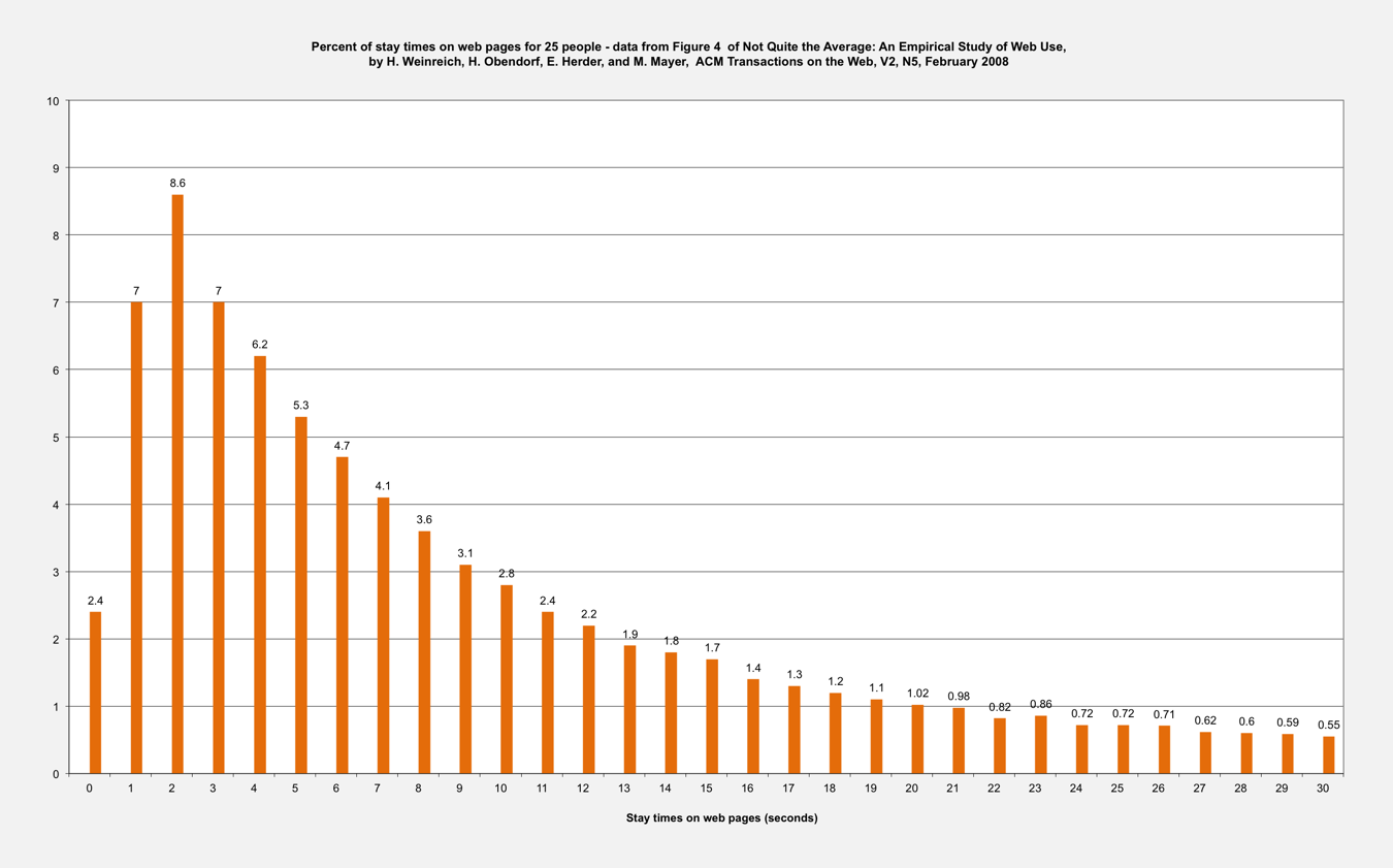
The second half of their table shows internet browsing statistics from a magazine article by H. Weinreich et al, which I’ve blogged about recently. The median was 9.4 seconds, so we really are about even with goldfish. But, the histogram (shown above) has such long tails that the alleged drop from 12 to 8 seconds likely would be insignificant.   


Internal Inconsistencies and Nonsense

The Fear/Phobia Statistics page at Statistic Brain says their source was the National Institute of Mental Health, and the research date was July 8, 2014. The lower half is a Top Phobias list (really a fears list). Back in 2012 I blogged about how it was just A bogus list of top ten phobias. They didn’t give a clue about where that list really came from.


I previously blogged about Putting the fear puzzle pieces together: social and specific fears in the National Comorbidity Survey. That mental health survey was sponsored by the National Institute of Mental Health. As shown above, there is a crucial difference between that list and the one at Statistic Brain. Social fears are a broader term, so a larger percentage (38.6%) fears them than fears public speaking (30.2%). The list at Statistic Brain inconsistently shows 74% fear public speaking and only 7.9% fear people or social situations.    


As shown above in a bar chart, the more recent National Comorbidity Survey - Replication also shows social fears are a broader term, so a larger percentage (24.1%) fears them than fears public speaking (21.2%). Another fears list on a page at the Speech Topics Help web site has the same problem Statistic Brain does.


As is shown above, the Speech Topics Help web page lists the same top ten as Statistic Brain does, with the first seven in the exact same order. The percentages on that page are shown in a pie chart. Since they must add to 100% the top three are quite a bit lower than those at Statistic Brain. Where did Statistic Brain get their percentages? I don’t know, and neither do you. So, please don’t quote their numbers as having come from the National Institute of Mental Health


Update on March 14, 2017

The BBC World Service radio program More or Less had a nine minute long story  titled The Attention Span of a Goldfish debunking the Statistic Brain claim. 


Update on July 15, 2017

I forgot to mention that  on February 6, 2014 I had emailed NIMH Info to ask about the Fear of Public Speaking Statistics and Fear/Phobia Statistics pages at Statistic Brain.

The reply from the NIMH Information Resource Center began as follows:

"Dear Mr. Garber:

Thank you for your email to the National Institute of Mental Health (NIMH).  The NIMH is part of the National Institutes of Health (NIH), an agency of the U.S. Department of Health and Human Services (HHS).  The NIMH conducts and supports research on the brain and disorders of mental health.

You requested assistance refuting or confirming statistics on the prevalence of various phobias from the Statisticbrain.com website.  The statistics you are asking about did not come from the NIMH.


Wednesday, December 3, 2014

Never say never


Many absolute statements are nonsense. Back in February I blogged about One-track minds: exactly, absolutely, always. Negative absolutes are as bad or worse. For example:

“Without exception, you should never start your speech by telling a joke.”

What if it was for a Toastmasters Humorous Speech Contest? Never does belong in warning statements where there are lethal consequences. Avoid it otherwise.

Using never (or not any) may inspire contrary behavior. On page 93 of his autobiographical 1989 book, Chuck Amuck, famous animator Chuck Jones described how producer Eddie Selzer had led him and Mike Maltese to create animated cartoons:

“He once appeared in the doorway of our story room while Mike Maltese and I were grappling with a new story idea. Suddenly a furious dwarf stood in the doorway: ’I don’t want any gags about bullfights, bullfights aren’t funny!’ Exactly the words he used to Fritz Freleng about never using camels. Out of that dictum came Sahara Hare, one of the funniest cartoons ever made, with the funniest camel ever made.

Having issued his angry edict, Eddie stormed back to his office. Mike and I eyed each other in silent wonderment. ‘We’ve been missing something,’ Mike said. ‘I never knew there was anything funny about bullfighting until now. But Eddie’s judgment is impeccable. He’s never been right yet.’ ‘God moves in wondrous ways, his story ideas to beget,’ I replied.

Result: Bully for Bugs - one of the best Bugs Bunny cartoons our unit ever produced.”


Monday, December 1, 2014

Celebrating 1000 blog posts


Yesterday’s post was a big milestone for me after over six years of blogging.

Is 1000 difficult to imagine? Not really. There are 1000 little face icons in the image shown above. (Click on it for a larger, clearer version). It was created in PowerPoint by typing ten rows of ten (alternating smiley, neutral, and frowny ones) using the Wingdings font, copying that slide, changing the color, and then saving those two squares of 100 as Pictures (.png). Then those squares were shrunk down and assembled to form the final tiled image. 

What’s the strangest story I’ve ever seen in researching to write this blog? On page 68 of the November 21, 1846 issue of Scientific American (Volume 2, Number 9) there is a brief story simply titled Mount Hand. It claims:


“The above engraving represents a watering place for travelers on the road from the City of Mexico to Santa Fe.

In the distance is seen the celebrated Mount Hand, so called from the fact that its wonderful apex is the exact profile of a hand.

It is considered one of the most extraordinary natural curiosities, known to exist on the Western Continent, and excites the astonishment of all. 

The Mexican muleteers are said to fall on their knees and cross themselves immediately on coming in sight of EL MANO (THE HAND) which their superstition teaches them to regard with awe.” 


I came up empty when I tried to find more about Mount Hand by searching on Google. Maybe that story should have been in The Onion.

Sunday, November 30, 2014

Cooking pakoras in a waffle iron


There is more than one path for reaching an objective, like writing a great speech. A decade ago during August in Portland we attended the Bite of Oregon. One of the local Indian restaurants sold us excellent spinach and onion pakoras. They are delicious  deep-fried fritters made with a chickpea flour (besan) based batter as shown above.

A few weeks later I found a recipe, bought a bag of besan, and mixed up a batch. Then I realized that  a) we didn’t have enough oil to deep fry, and b) anyway it would undesirably heat up the kitchen.


That’s when I decided to try ladling the batter into our waffle iron, and baking a few waffles rather than frying a bunch of little fritters. Those pakora waffles got cut into squares for serving. They were great, and not as oily as the deep-fried ones.

I was inspired by having watched a 2002 episode of Alton Brown’s Good Eats TV show (This Spud’s for You Too) where he made Rösti, a Swiss cake like hash brown potatoes in a waffle iron.  

Late this summer Daniel Shumski published a book titled Will It Waffle: 53 Irresistible and Unexpected Recipes to Make in a Waffle Iron. One is for Fawaffle, a waffle iron version of another chick pea based food, falafel. You can also find Mr. Shumski’s recipe here. Falafel is often served with hummus, which contains more chick peas and tahini (sesame seed paste). Mr. Shumski suggests substituting peanut butter if you don’t have tahini, but I’ve also seen toasted sesame oil used. Use what you have, and go make something great.   

Back in 2011 Nick Morgan had an article both on his Public Words blog and at Forbes on How to Write a Great Speech: 5 Secrets for Success. Those secrets were that:

Great speeches are primarily emotional, not logical.
  
Small shifts in tone make an enormous difference to the audience, so sweat the details.

A great speech has a clear voice speaking throughout.

A great speech conveys one idea only, though it can have lots of supporting points.

A great speech answers a great need.


Images of pakoras and a waffle iron came from Wikimedia Commons.

Monday, November 24, 2014

Room at the Table: a song for Thanksgiving


A well-crafted song tells a memorable story with both words (poetry) and music. In April singer-songwriter Carrie Newcomer released her latest CD, A Permeable Life. Six of the twelve songs are out as lyrics videos on YouTube. Her song Room at the Table fits very well with the upcoming Thanksgiving holiday.


The other five songs with lyrics videos are:  

A Light in the Window

Every Little Bit of It

Abide

Forever Ray

Visitation

You can download all the lyrics in a pdf file here.

The other six songs are:

The Work of Our Hands

Thank You, Good Night

The Ten O’clock Line

Writing You a Letter

Please Don’t Put Me on Hold

An Empty Chair

The lyrics sheet explains that An Empty Chair was inspired by seeing the Oklahoma City National Memorial. It has a field of 168 empty chairs representing each person who died in the April 19,1995 bombing of the Murrah Building.

The image was adapted from a 120 year-old Harper's Bazaar cover.

Update

The November 26th episode of On Being was Carrie Newcomer: A Conversation with Music.
On November 5th Carrie appeared on Mountain Stage.

Friday, November 21, 2014

How to fry a turkey without burning down your home

Sometimes a demonstration is the best way to present a topic. Deep frying is one way to quickly cook a juicy turkey for Thanksgiving dinner. If done wrong, it’s also possible to start a fire that could burn down your home and wreck the holiday celebration.


Last year the Boise Fire Department did this video demonstration of what could go wrong. It isn’t the only cautionary video out there, but I think people are more likely to listen to their city fire marshal than someone distant. Underwriters Laboratories has one and State Farm has another.   

At the Food Network, Alton Brown has an instructional video along with a detailed description of how to build a Turkey Derrick

Wednesday, November 19, 2014

Turn back your cocks?


On Sunday, November 2nd, Daylight Savings Time ended. Brief newspaper articles advised us to turn back our clocks. Some added that we should also:

A. Change the batteries in our smoke alarms.
B. Program our thermostat for heating.
C. Change our water filter.


A comment on a blog post by Patricia Saxton from 2011 titled Why bother to proofread? mentioned that a front-page headline in the Lake County News-Herald  from Willoughby, Ohio instead advised their readers to:

 "Turn Back Your Cocks Tonight"


That headline is an example where You All Know What I Really Meant, which I’ve given the long silly acronym of a YAKWIRM. Please proofread, and keep those naughty yakwirms away.

Tuesday, November 18, 2014

Serving your audience by answering their questions


An after-dinner speech provides a unique opportunity for answering questions after a presentation. There is not another speaker waiting for you to finish so he or she can start. You can provide a more detailed answer that shows how it fits into a broader subject.

A decade ago I heard George Vander Voort speak about Metallography of Welds at a dinner meeting of the Oregon Chapter of ASM International in Portland. George delivered a PowerPoint presentation containing lots of images of cross-sectioned, polished, and etched weld joints in a wide variety of materials. Then he took several questions about that specific presentation. (More recently George discussed that topic in a 2011 magazine article).

Next he asked the audience if there were any questions about metallography in general. George said I’m here to serve you, so ask away. His answers to several questions each  included showing a series of images from other presentations stored on his laptop. It was a virtuoso performance. George has a very rare breadth and depth of knowledge. (I have a copy of his 750-page book, Metallography: Principles and Practice). But, you don’t need  that depth to adopt his attitude of servant leadership.


Thinking back, what George’s performance reminded me of was watching someone set up an extension table for a family Thanksgiving dinner. Small pieces are fitted together to form a larger, more inclusive whole.      

The image of puzzle pieces came from OpenClipart, and the extension table from Scientific American.

Monday, November 17, 2014

Perspectives from Epictetus on luggage, property, eloquence, and writing obscurely


In Chapter 43 of the Enchiridion (authored by his disciple Arrian) the Stoic philosopher Epictetus reportedly says:

“Everything has two handles, by one of which it ought to be carried and by the other not.”

That’s still excellent advice about luggage. He continued that:

“If your brother wrongs you, do not lay hold of the matter by the handle of the wrong that he is doing, because this is the handle by which the matter ought not be carried; but rather by the other handle - that he is your brother, that you were brought up together, and then you will be laying hold of the matter by the handle by which it ought to be carried.”

In the following Chapter 44 he points out that:

“The following statements constitute a non sequitur: ‘I am richer than you, therefore I am superior to you’; or ‘I am more eloquent than you, therefore I am superior to you’. But the following conclusions are better: ‘I am richer than you, therefore my property is superior to yours’; or ‘I am more eloquent than you, therefore my eloquence is superior to yours’. But you are neither property nor eloquence.”

Then in Chapter 49 he says:

“When a person gives himself airs because he can understand and interpret the books of Chrysippus, say to yourself, ‘If Chrysippus had not written obscurely, this man would have nothing about which to give himself airs.’

“But what is it I want? To learn nature and to follow her. I seek, therefore, someone to interpret her; and having heard Chrysippus does so, I go to him. But I do not understand what he has written; I seek therefore the person who interprets Chrysippus. And down to this point there is nothing to justify pride. But when I find the interpreter, what remains is to put his precepts into practice; this is the only thing to be proud about....” 


I’ve quoted from pages 527, 529, and 533 of W. A. Oldfeather’s 1928 translation of the Enchiridion. Reading a book by Henry Petroski, the Duke University professor of both civil engineering and history, got me to look up Epictetus. He used another translation of the first quote at the beginning of Chapter 2 in his 2006 book Success through Failure: The Paradox of Design.

Sunday, November 16, 2014

Does it take 9, 90, or 900 seconds to lose your audience’s attention?


On page 87 of the 2008 edition of his book Presenting to Win Jerry Weissman said:

“Always remember the importance of the start of your presentation. If you lose your audience within that first 90 seconds, chances are that they will be lost forever.”

On November 10th Dr. Michelle Mazur blogged about Gone in 9 Seconds: Is Your Presentation Losing Your Audience? She claimed instead that:

“You only have 9 seconds to capture your audience’s attention.

Is your jaw on the floor? Are you thinking ‘Michelle’s nuts where is she getting this information?’

In Sally Hogshead’s new book How the World Sees You, I was astounded to learn that you have 9 seconds to fascinate your audience.”


Really? Is this a stunning new insight which came from careful public speaking research on audiences? Well, of course not! Sally started out as an ad copywriter. She dug up and has been peddling that 9 second claim for several years. On page 58 of her 2010 book Fascinate: Your 7 Triggers to Persuasion and Captivation she said:

“According to BBC News, ‘The addictive nature of web browsing can leave you with an attention span of nine seconds - the same as a goldfish.’ “

That BBC News article was titled Turning into digital goldfish and it appeared back on February 22, 2002. Sally just quoted the opening sentence.

How meaningful is an average (median?) of nine seconds spent on a web page? I looked up an often-cited magazine article from February 2008 by H. Weinreich, H. Obendorf, E. Herder and M. Mayer titled Not Quite the Average: An Empirical Study of Web Use that appeared in the ACM Transaction on the Web, Vol. 2, No. 1. They looked at a sample of 25 web users. Figure 4 of that article presents a histogram of the distributions of stay times for all participants at one-second intervals. They had shown results for both first-time visits, and all visits.


The histogram shown above just displays their results for all visits. (Click on it to see a larger, clearer version). They noted:

“....participants stayed only for a short period on most pages. 25% of all documents were displayed for less than 4 seconds, and 52% of all visits were shorter than 10 seconds (median: 9.4s). However, nearly 10% of the page visits were longer than two minutes. Figure 4 shows the distribution of stay times grouped in intervals of one second. The peak value of the average stay times is located between 2 and 3 seconds; these stay times contribute 8.6% of all visits.”

You could describe this “attention span” as including 0.9, 9, and 90 seconds. 
 
How long ago has a nine second attention span been discussed in books? At least 45 years - describing some work done at Northwestern University. But, it hasn’t gotten much traction and mainly has been forgotten. A Handbook for the Advertising Agency Account Executive, published back in 1969 by Addison-Wesley claimed on page 69 that:

“Over the past several years, research has been conducted at the Northwestern School of Speech on the attention span of adults. They found the average attention span of an adult is approximately 9 seconds.

That makes a sudden death situation for the speaker in that he holds his audience for a time period about as long as this sentence.”


Then David A. Peoples 1992 book Presentations Plus: David Peoples’ Proven Techniques summarized it on page 75 as:

“The Northwestern School of Speech reports that the attention span of an audience is approximately nine seconds.”

Lenny Laskowski repeated exactly what Mr. Peoples had said on page 79 of his 2001 book 10 Days to More Confident Public Speaking.

How about 900 seconds (15 minutes)? TED Talks routinely run for 18 minutes, and people don’t seem to lose their attention for less than that interval.

Saturday, November 15, 2014

Is trying to cure fear of public speaking hopeless?

Of course not! But you might get that impression after reading an infographic that was posted recently. On October 17th Tom Woods blogged about and posted one titled Six Ways Your Public Speaking Fear is Ruining Your Career. On November 7th Shane Purnell reposted it at Platform Giant with the title How is Fear of public speaking ruining your career?

When I visually put together two of Tom’s statements, I reached an appalling conclusion.


One of Tom’s statements was that:

 “75% of people have a fear of public speaking.”

He illustrated it with two rows of five person icons that had 7 out of 10 colored blue. I have correctly shown it above with 15 out of 20 (although elsewhere I have also used the minimum, 3 out of 4).


Another of Tom’s statements was that:

 “Only 1 in 7 people manage to cure their fear of public speaking.”

We can show that roughly by checking off 2 of the 15 people, as shown above.


Now what we would have left is still 65% of people with a fear of public speaking. That sounds rather hopeless, but really is not - because the first statement is silly. Back in February I blogged about Busting a myth - that 75% of people in the world fear public speaking.  

In his infographic Tom also spouts the same old Mehrabian Myth that how you communicate is 55% body language, 38% tone of your voice, and 7% what you actually say. He does not say where it came from, although he has elsewhere in his Quick Start Guide.

Shane ends his post by stating what he calls a practical tip to for today, but it’s just the Mehrabian Myth. Aargh!

UPDATE

The infographic now can be found here.