Saturday, August 29, 2015
Going to the dark side with a redesign of PowerPoint slides
Design of PowerPoint slides and other visual aids is partly an art. At Ehhos3 on Thursday, August 27th Leslie Belknap blogged about How We Redesigned Slides For A Buffer and Moz Webinar.
Three of the four very artistic revised slide examples were extremely dark. I mean dark like Van Gogh’s painting of The Potato Eaters (shown above), not like Darth Vader in the Star Wars films. Slides with a dark image background will work in a webinar, since each participant can adjust his screen settings to make them legible.
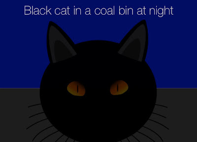
Don’t try slides this dark within a presentation that will be projected in a meeting room though. The blinds or curtains might not darken the room enough, or there just might be a whiteboard rather than a high-contrast projection screen. The resulting lack of contrast might approach the following cliche.
Subscribe to:
Post Comments (Atom)


No comments:
Post a Comment