At the D. John Carlson web site I found an article from
August 31, 2017 titled 48.2% take 1 – 3 hours which also appeared at LinkedIn Pulse. It began:
“Research in the United States has found that there is
significant variability in the time that bloggers take to craft high quality
content. Headline findings were as follows:
1
hour – 7.7%
1-2
hours – 24.7%
2-3
hours – 23.5%
3-4
hours – 19%
4-6
hours – 13.3%
6+
hours – 11.9%”
Mr.
Carlson’s article referred to but did not bother to provide a link to the FitSmallBusiness
web site.
A search revealed that information came from a July 22, 2017 article at FitSmallBusiness by Henry Kanapi titled 15 Business Blogging Statistics That You Should Know. Number 8 was how long does it usually take to write an average blog post? Results were displayed in the qualitative pyramid chart shown above. But widths of the rows are unrelated to the percent for each time period. Also, heights of the rows are not constant, and the colors orange, yellow, and blue are repeated for no obvious reason. So, this idiotic graphic is neither meaningful nor pretty.
That data reportedly came from Statistica, which expects you
to pay to see them. But those results really came from a 2016 survey done by Orbit
Media Studios that was reported in a blog post by Andy Crestodina titled New
Research: 3rd Annual Survey of 1000+ Bloggers (time, length, and
tactics).
As shown above, that blog post reports more interesting and useful results for 2014, 2015, and 206 on both the average time for writing a blog post (hours), and the average length (words). In 2016 the average time was 3.27 hours and the average length was 1054 words. How else might we display those six percentages that appeared on that pyramid chart?
One possibility is via a standard horizontal bar chart, as is shown above.
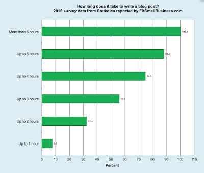
Another is via a horizontal bar chart showing the cumulative percentages, as shown above. From it we could see that slightly over half (55.9%) of blog posts took 3 hours or less, and almost exactly 3/4 (74.9%) took 4 hours or less.
If you want to tell people something interesting and useful,
then you need to get back to the original source for data rather than settling
for a secondary one.


No comments:
Post a Comment