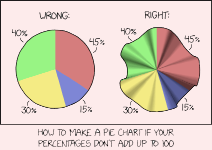
On August 10, 2018 Randall Munroe posted an xkcd cartoon titled Pie Charts. As shown above, he illustrated how to warp (or pleat) the chart out of the usual plane so you could somewhat legitimately cram in 130%.
I detest pie charts and donut charts. On March 17, 2016 I
blogged that 3-D Pie Charts are the Spawn of Satan. Since then I saw that on February
16, 2017 Cole Nussbaumer Knaflic had posted on her Storytelling with Data blog An
Updated Post on Pies. She referred to a May 30, 2016 article by Robert Kosara
at EagerEyes titled A pair of pie chart papers that discusses how they actually
can work. One is titled Arcs, angles, or areas: individual data encodings in
pie and donut charts; the other is Judgement error in pie chart variations. More
recently there also was another article by X. Cai et al. titled A study of the
effect of doughnut chart parameters on proportion estimation accuracy.
Sometimes people cram way more than 130% into a pie chart. On
December 22, 2013 I had blogged about ‘tis the season for pies and artistic charts
about them – and gave an example with an outrageous 271%. On December 1, 2009
at his Peltier Tech Blog Jon Peltier blogged about how I Keep Saying, Use Bar
Charts, Not Pies. He showed a Fox News pie chart with 193% that really should
have added another segment for a total of 251%.

There is a real object called a wave washer that can be used as a spring. You could cover with a warped donut chart. (The image came from Wikimedia Commons).
No comments:
Post a Comment