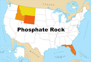
The map on top has captions showing commodities that are produced in each state. A series of maps on the bottom instead are blackened to show the states that produce each commodity. When you look at the upper left in the top map, you will see that my state, Idaho, produces phosphate rock (used to make fertilizer).
There is no map on the bottom to show which other states also produce phosphate rock. When you look around starting from Idaho you almost immediately can find that its two adjoining states of Montana and Wyoming also produce phosphate. What other state produces phosphate? It probably took you five or ten seconds to find that the answer is Florida. The graphic shown below makes it easy to find Florida.
In fact, Florida produces most of the phosphate in the US, as is discussed in a recent Scientific American article: Phosphorus Famine: The Threat to Our Food Supply.

No comments:
Post a Comment