Recently they changed their Sign In screen to that shown above (recolored to green) - so now I have to enter my email name on one screen, click Next, and then enter my password on another. They used to have one screen where I could complete logging in by pressing the tab key to go from the email name to the password.
They never asked but also split up my inbox into two categories labeled Focused and Other. Very weirdly they put my daily Google Alert into Other, although it’s where I’m Focused. I looked up how to undo those settings, and reset to a single inbox.
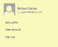
Even more weird is that when I go to sign out they first show a short menu (above, recolored) which then changes to a longer menu (below, recolored). I don’t look at my email on my phone, so I haven’t figured out if the short menu is for mobile users with small screens.


No comments:
Post a Comment